// NewSections.jsx — sales-page-specific sections added on top of the
// pre-launch landing: Features, Comparison, ProductDemo, WhoItsFor,
// FounderStory, CohortBenefits, Pricing, FAQ.
//
// All copy is placeholder-grade but written in the page's editorial tone.
// Search [TODO:] to find the few spots that need your input (Stripe links,
// founder photo, pricing confirmation).

const { useState: useNSt } = React;

// ── FEATURES ────────────────────────────────────────────────
window.FeaturesSection = function FeaturesSection() {
  const features = [
    {
      n: "01",
      t: "Memory that sticks.",
      body: "Your brand, voice, audience, offers, and preferences live in one layer every specialist reads from. Say it once. It's remembered across every draft, every format, forever.",
      icon: "/illustrations-objects/memory-kept.png",
      accent: "coral",
    },
    {
      n: "02",
      t: "A voice trained on yours.",
      body: "Every specialist learns how you write through writing samples and a few sharp preference questions. No generic AI tone. No vague \"sound professional\" prompts. Just your voice, warmed up.",
      icon: "/illustrations-objects/voice-trained.png",
      accent: "iris",
    },
    {
      n: "03",
      t: "One place, not scattered chats.",
      body: "Newsletter, reel, carousel, sales page, podcast outline, all in one studio with one brand context. Stop tab-hopping and prompt-hunting through old conversations you can't find.",
      icon: "/illustrations-objects/one-place.png",
      accent: "sage",
    },
    {
      n: "04",
      t: "A schedule that runs itself.",
      body: "Set your cadence once. The Studio fills the queue with drafts ready on the days you want them. You stay in the editor's seat, not the project manager's.",
      icon: "/illustrations-objects/runs-itself.png",
      accent: "gold",
    },
  ];

  return (
    <section className="scs-features-section" style={{
      padding: "120px 32px", background: "var(--white)",
      position: "relative", overflow: "hidden",
    }}>
      <style>{`
        @media (max-width: 760px) {
          .scs-features-grid {
            grid-template-columns: 1fr !important;
          }
          .scs-feature-card {
            padding: 24px !important;
            gap: 16px !important;
          }
          .scs-feature-card > img {
            width: 64px !important;
            height: 64px !important;
          }
        }
      `}</style>
      <window.MeshBg variant="cool" style={{ opacity: 0.5 }} />
      <div style={{ position: "relative", maxWidth: 1200, margin: "0 auto" }}>
        <div style={{ textAlign: "center", marginBottom: 64, maxWidth: 760, marginInline: "auto" }}>
          <window.Eyebrow style={{ marginBottom: 14, color: "var(--orange)" }}>
            One organized place for your content.
          </window.Eyebrow>
          <h2 style={{ fontSize: "clamp(38px, 5vw, 64px)", lineHeight: 1.02, letterSpacing: "-0.025em", margin: "0 0 18px" }}>
            Four ways The Studio beats your <em>AI chat.</em>
          </h2>
          <p style={{
            fontSize: 18, lineHeight: 1.55, color: "var(--ink-light)",
            margin: 0, maxWidth: 640, marginInline: "auto",
          }}>
            Why The Studio is an upgrade from using ChatGPT, Claude, and Gemini
            for all your content creation needs.
          </p>
        </div>

        <div className="scs-features-grid" style={{
          display: "grid",
          gridTemplateColumns: "repeat(2, 1fr)",
          gap: 20,
        }}>
          {features.map((f, i) => (
            <div key={f.n} className="scs-feature-card scs-reveal" style={{
              background: `var(--${f.accent}-3)`,
              border: "1px solid var(--border)",
              borderRadius: 22,
              padding: "32px 32px 28px",
              display: "flex", gap: 22,
              boxShadow: "var(--shadow-sm)",
              "--scs-delay": `${i * 70}ms`,
            }}>
              <img src={f.icon} alt="" style={{
                width: 84, height: 84, objectFit: "contain", flexShrink: 0,
              }} />
              <div>
                <div style={{
                  fontFamily: "var(--font-mono)", fontSize: 10,
                  letterSpacing: "0.14em", textTransform: "uppercase",
                  color: `var(--${f.accent}-1)`, marginBottom: 8,
                }}>→ {f.n}</div>
                <h3 style={{
                  fontFamily: "var(--font-display)", fontSize: 26,
                  letterSpacing: "-0.015em", lineHeight: 1.1,
                  color: "var(--ink)", margin: "0 0 10px",
                }}>{f.t}</h3>
                <p style={{
                  fontSize: 15, color: "var(--ink-light)", lineHeight: 1.55, margin: 0,
                }}>{f.body}</p>
              </div>
            </div>
          ))}
        </div>
      </div>
    </section>
  );
};

// ── ADVANTAGES STACKED ──────────────────────────────────────
// Sits below pricing, before FAQ — soft objection-handling without naming
// objections. Each row is a natural thought paired with what's in the bundle
// that resolves it. No "your worry" labels.
window.ComparisonSection = function ComparisonSection() {
  const phase = window.SCS_PHASE || {};
  const isPostCohort = phase.mode === "post-cohort";

  const advantagesFounding = [
    {
      n: "01",
      thought: "What if the output doesn't sound like me and I just have to rewrite everything?",
      title:   "Specialists trained on your voice.",
      body:    "Each specialist learns how you actually write through preference questions and your own writing samples. Drafts come out sounding like you, not like generic AI.",
    },
    {
      n: "02",
      thought: "How long before this actually starts producing good content?",
      title:   "Spend 30 minutes training specialists.",
      body:    "Once trained, you can give a simple content creation prompt and drafts will appear in seconds. You save hours every day.",
    },
    {
      n: "03",
      thought: "Can this keep up with my content demands, or will I get cut off right when it gets useful?",
      title:   "1,000 credits a month, every month.",
      body:    "Enough for roughly 6 newsletters, 4 blog posts, 3 email sequences, 40 tweets, 10 LinkedIn posts, 4 podcast episodes, 4 YouTube videos, and 20 Reels. Different formats use different credit amounts. Run light or run heavy, the credits flex with you.",
    },
    {
      n: "04",
      thought: "How do I actually learn to use this well?",
      title:   "Live training with us on May 14.",
      body:    "Caroline and Jason walk through a fully trained Studio on Zoom, then hand you the controls for fifteen minutes of hands-on. The fastest way to get fluent.",
    },
    {
      n: "05",
      thought: "Are the good features going to cost extra later?",
      title:   "Pro features locked in for $49/mo.",
      body:    "Drafting from your phone. Unlimited content regeneration. More than 2 projects. Full export rights. Normally $199/mo as a Pro feature set. Founding members lock all of them into the $49/mo founding rate for 12 months. That's $1,800 saved over your first year.",
    },
    {
      n: "06",
      thought: "What if I get stuck and there's no one to ask?",
      title:   "A community of creators, right inside the app.",
      body:    "You'll join us and a group of ~100 solopreneurs building Studios right alongside you. Get questions answered, share feedback, and we even have a fun \"focus mode\" to keep you on task.",
    },
  ];

  // Post-cohort variant. Drops the May 14 cohort kickoff and the
  // founding-rate lock-in, swaps in evergreen messaging that still
  // reassures the same objections.
  const advantagesPostCohort = [
    {
      n: "01",
      thought: "What if the output doesn't sound like me and I just have to rewrite everything?",
      title:   "Specialists trained on your voice.",
      body:    "Each specialist learns how you actually write through preference questions and your own writing samples. Drafts come out sounding like you, not like generic AI.",
    },
    {
      n: "02",
      thought: "How long before this actually starts producing good content?",
      title:   "Spend 30 minutes training specialists.",
      body:    "Once trained, you can give a simple content creation prompt and drafts will appear in seconds. You save hours every day.",
    },
    {
      n: "03",
      thought: "Can this keep up with my content demands, or will I get cut off right when it gets useful?",
      title:   "1,000 credits a month on Standard, 2,500 on Pro.",
      body:    "1,000 credits is roughly 6 newsletters, 4 blog posts, 3 email sequences, 40 tweets, 10 LinkedIn posts, 4 podcast episodes, 4 YouTube videos, and 20 Reels. Different formats use different credit amounts. Run light or run heavy, the credits flex with you. Out of credits? Buy a top-up any time.",
    },
    {
      n: "04",
      thought: "What if I just want to try this without committing?",
      title:   "7-day Standard Plan trial. Card required, $0 today.",
      body:    "Start with 100 credits, Standard access to all ten specialists and Autopilot. After 7 days, or after you confirm continuing past the 100-credit cap, Standard billing starts at $99/mo unless you cancel.",
    },
    {
      n: "05",
      thought: "Are the good features going to cost extra later?",
      title:   "Pro unlocks the heavy-usage features.",
      body:    "Drafting from your phone. Unlimited content regeneration. Unlimited projects. Full export rights. All included on Pro Plan at $199/mo (or $160/mo billed yearly). Standard Plan ($99/mo) covers the same ten specialists with 1,000 credits and 2 projects — switch up to Pro any time.",
    },
    {
      n: "06",
      thought: "What if I get stuck and there's no one to ask?",
      title:   "A community of creators, right inside the app.",
      body:    "You'll join solopreneurs building Studios right alongside you. Get questions answered, share feedback, and we even have a fun \"focus mode\" to keep you on task. Community is included on Standard and Pro.",
    },
  ];

  const advantages = isPostCohort ? advantagesPostCohort : advantagesFounding;

  return (
    <section className="scs-stack-section" style={{
      padding: "120px 32px", background: "var(--cream)",
      position: "relative", overflow: "hidden",
    }}>
      <style>{`
        .scs-advantage-row {
          display: grid;
          grid-template-columns: 44px 1fr 36px 1.2fr;
          gap: 22px;
          align-items: center;
        }
        @media (max-width: 760px) {
          .scs-advantage-row {
            grid-template-columns: 36px 1fr !important;
            gap: 12px !important;
            row-gap: 14px !important;
            align-items: start !important;
          }
          .scs-advantage-arrow { display: none !important; }
          .scs-advantage-solution {
            grid-column: 2 / 3 !important;
            position: relative;
            padding-top: 4px !important;
          }
          .scs-advantage-solution::before {
            content: "↓";
            display: inline-block;
            margin-right: 8px;
            color: var(--orange);
            font-weight: 700;
          }
        }
      `}</style>
      <div style={{
        position: "absolute", inset: 0, pointerEvents: "none",
        background: "radial-gradient(ellipse 60% 40% at 50% 0%, hsla(258, 50%, 85%, 0.25), transparent 60%)",
      }} />
      <div style={{ position: "relative", maxWidth: 1080, margin: "0 auto" }}>
        <div style={{ textAlign: "center", marginBottom: 56, maxWidth: 760, marginInline: "auto" }}>
          <window.Eyebrow style={{ marginBottom: 14, color: "var(--orange)" }}>
            Every advantage, stacked
          </window.Eyebrow>
          <h2 style={{ fontSize: "clamp(36px, 4.8vw, 58px)", lineHeight: 1.03, letterSpacing: "-0.025em", margin: "0 0 16px" }}>
            Designed to make 10×&nbsp;output <em>actually happen.</em>
          </h2>
          <p style={{
            fontSize: 18, lineHeight: 1.55, color: "var(--ink-light)",
            margin: 0, maxWidth: 620, marginInline: "auto",
          }}>
            We've thought through every advantage that helps you publish more content,
            more consistently, with less effort. Here&rsquo;s what&rsquo;s in the bundle.
          </p>
        </div>

        <div style={{ display: "flex", flexDirection: "column", gap: 14 }}>
          {advantages.map((a, i) => (
            <div key={a.n} className="scs-advantage-row scs-reveal" style={{
              background: `
                radial-gradient(ellipse 80% 70% at 0% 0%, hsl(12 70% 96% / 0.7) 0%, transparent 55%),
                radial-gradient(ellipse 70% 80% at 100% 100%, hsl(38 75% 95% / 0.65) 0%, transparent 55%),
                var(--white)
              `,
              border: "1px solid hsl(12 50% 90%)",
              borderRadius: 16,
              padding: "26px 28px",
              boxShadow: "0 8px 24px hsl(12 72% 40% / 0.06)",
              "--scs-delay": `${i * 60}ms`,
            }}>
              {/* Number */}
              <div style={{
                fontFamily: "var(--font-mono)", fontSize: 11,
                letterSpacing: "0.14em", textTransform: "uppercase",
                color: "var(--orange)", fontWeight: 600,
              }}>
                → {a.n}
              </div>

              {/* Thought (left, italic, no label) */}
              <div className="scs-advantage-thought" style={{
                fontFamily: "var(--font-emphasis)", fontStyle: "italic",
                fontSize: 21, lineHeight: 1.4,
                color: "var(--ink-light)",
              }}>
                &ldquo;{a.thought}&rdquo;
              </div>

              {/* Arrow chip */}
              <div className="scs-advantage-arrow" style={{
                display: "flex", alignItems: "center", justifyContent: "center",
                width: 32, height: 32, borderRadius: "50%",
                background: "var(--orange-light)",
                border: "1px solid hsl(12 60% 84%)",
                color: "var(--orange-deep)",
                fontFamily: "var(--font-mono)", fontSize: 14, fontWeight: 700,
                flexShrink: 0,
              }}>
                →
              </div>

              {/* Solution (right, title + body) */}
              <div className="scs-advantage-solution">
                <h3 style={{
                  fontFamily: "var(--font-display)", fontWeight: 400,
                  fontSize: 21, lineHeight: 1.2,
                  letterSpacing: "-0.015em",
                  color: "var(--ink)",
                  margin: "0 0 6px",
                }}>
                  {a.title}
                </h3>
                <p style={{
                  fontSize: 14.5, lineHeight: 1.55,
                  color: "var(--ink-light)",
                  margin: 0,
                }}>
                  {a.body}
                </p>
              </div>
            </div>
          ))}
        </div>
      </div>
    </section>
  );
};

// ── PRODUCT DEMO (replaces the blurred Peek) ────────────────
window.ProductDemoSection = function ProductDemoSection() {
  return (
    <section id="demo-video" className="scs-demo-section" style={{
      padding: "120px 32px", background: "var(--white)",
      position: "relative", overflow: "hidden",
    }}>
      <window.MeshBg variant="warm" style={{ opacity: 0.4 }} />
      <div style={{ position: "relative", maxWidth: 1000, margin: "0 auto" }}>
        <div style={{ textAlign: "center", marginBottom: 48, maxWidth: 740, marginInline: "auto" }}>
          <window.Eyebrow style={{ marginBottom: 18, color: "var(--orange)" }}>A look inside</window.Eyebrow>
          <h2 style={{ fontSize: "clamp(36px, 4.8vw, 60px)", lineHeight: 1.03, marginBottom: 18, letterSpacing: "-0.025em" }}>
            Three minutes inside <em>the Studio.</em>
          </h2>
          <p style={{ fontSize: 18, color: "var(--ink-light)", lineHeight: 1.55, margin: 0 }}>
            A peek at the team, the training, and the drafts they hand back in your voice.
          </p>
        </div>

        <div style={{
          position: "relative",
          paddingTop: "56.25%",
          borderRadius: 22,
          overflow: "hidden",
          background: "#000",
          border: "1px solid var(--border)",
          boxShadow: "0 32px 80px -24px hsla(348, 40%, 20%, 0.25), var(--shadow-sm)",
        }}>
          <iframe
            src="https://player.vimeo.com/video/1186705768?badge=0&autopause=0&player_id=0&app_id=58479"
            title="Inside The Solo Content Studio"
            allow="autoplay; fullscreen; picture-in-picture; clipboard-write; encrypted-media"
            allowFullScreen
            style={{ position: "absolute", top: 0, left: 0, width: "100%", height: "100%", border: 0 }}
          />
        </div>
      </div>
    </section>
  );
};

// ── WHO IT'S FOR ────────────────────────────────────────────
window.WhoItsFor = function WhoItsFor() {
  const forList = [
    "You're a solo business owner, coach, creator, or founder struggling to keep up with content.",
    "You publish across more than two formats a week and it feels like a grind.",
    "You've used ChatGPT or Claude enough to know what \"close but not quite me\" sounds like.",
    "You know good content takes time so you're willing to put in some effort up front one time.",
    "You'd rather train a specialist once than re-prompt the same AI chat forever.",
  ];
  const notForList = [
    "You run a large content team with writers and editors already in place.",
    "You want a tool that posts for you with zero human touch. (You won't love what that produces.)",
    "You want to skip setup entirely. The Studio earns its output from your training.",
  ];

  return (
    <section className="scs-whofor-section" style={{
      padding: "64px 32px 120px", background: "var(--snow)",
      position: "relative", overflow: "hidden",
    }}>
      <div style={{ position: "relative", maxWidth: 1100, margin: "0 auto" }}>
        <div style={{ textAlign: "center", marginBottom: 56, maxWidth: 780, marginInline: "auto" }}>
          <window.Eyebrow style={{ marginBottom: 14, color: "var(--orange)" }}>
            Built for a specific kind of person
          </window.Eyebrow>
          <h2 style={{ fontSize: "clamp(36px, 4.8vw, 60px)", lineHeight: 1.03, letterSpacing: "-0.025em", margin: 0 }}>
            Is this <em>for you?</em>
          </h2>
        </div>

        <div className="scs-whofor-grid" style={{
          display: "grid",
          gridTemplateColumns: "1.2fr 1fr",
          gap: 24,
        }}>
          {/* For */}
          <div className="scs-whofor-card scs-reveal" style={{
            background: "var(--white)",
            border: "1px solid var(--border)",
            borderRadius: 22, padding: "36px 36px 32px",
            boxShadow: "var(--shadow-sm)",
            position: "relative", overflow: "hidden",
          }}>
            <div style={{
              position: "absolute", inset: 0, pointerEvents: "none",
              background: "radial-gradient(ellipse 60% 40% at 10% 0%, hsla(12, 80%, 88%, 0.4), transparent 60%)",
            }} />
            <div style={{ position: "relative" }}>
              <window.Eyebrow style={{ marginBottom: 14, color: "var(--orange-deep)" }}>
                Yes · this is for you
              </window.Eyebrow>
              <h3 style={{
                fontFamily: "var(--font-display)", fontSize: 28,
                letterSpacing: "-0.015em", lineHeight: 1.15,
                margin: "0 0 22px",
              }}>
                You'll love Solo Content Studio if...
              </h3>
              <ul style={{ listStyle: "none", padding: 0, margin: 0, display: "flex", flexDirection: "column", gap: 14 }}>
                {forList.map((item, i) => (
                  <li key={i} style={{
                    display: "flex", gap: 12, alignItems: "flex-start",
                    fontSize: 16, lineHeight: 1.5, color: "var(--ink)",
                  }}>
                    <span style={{
                      flexShrink: 0, width: 22, height: 22, borderRadius: "50%",
                      background: "var(--orange)", color: "#fff",
                      display: "inline-flex", alignItems: "center", justifyContent: "center",
                      fontSize: 13, fontWeight: 700, marginTop: 1,
                    }}>✓</span>
                    <span>{item}</span>
                  </li>
                ))}
              </ul>
            </div>
          </div>

          {/* Not for */}
          <div className="scs-whofor-card scs-reveal" style={{
            background: "var(--cream)",
            border: "1px solid var(--border)",
            borderRadius: 22, padding: "36px 36px 32px",
            boxShadow: "var(--shadow-sm)",
            "--scs-delay": "120ms",
          }}>
            <window.Eyebrow style={{ marginBottom: 14, color: "var(--muted)" }}>
              No · This isn't for you
            </window.Eyebrow>
            <h3 style={{
              fontFamily: "var(--font-display)", fontSize: 26,
              letterSpacing: "-0.015em", lineHeight: 1.15,
              margin: "0 0 22px",
            }}>
              Probably <em>not the right fit</em> if...
            </h3>
            <ul style={{ listStyle: "none", padding: 0, margin: 0, display: "flex", flexDirection: "column", gap: 14 }}>
              {notForList.map((item, i) => (
                <li key={i} style={{
                  display: "flex", gap: 12, alignItems: "flex-start",
                  fontSize: 15, lineHeight: 1.5, color: "var(--ink-light)",
                }}>
                  <span style={{
                    flexShrink: 0, width: 22, height: 22, borderRadius: "50%",
                    background: "var(--cloud)", color: "var(--muted)",
                    display: "inline-flex", alignItems: "center", justifyContent: "center",
                    fontSize: 13, fontWeight: 700, marginTop: 1,
                  }}>–</span>
                  <span>{item}</span>
                </li>
              ))}
            </ul>
          </div>
        </div>
      </div>
    </section>
  );
};

// ── FOUNDER STORY ───────────────────────────────────────────
window.FounderStory = function FounderStory() {
  return (
    <section className="scs-founder-section" style={{
      padding: "120px 32px", background: "var(--white)",
      position: "relative", overflow: "hidden",
    }}>
      <window.MeshBg variant="warm" style={{ opacity: 0.35 }} />
      <div style={{ position: "relative", maxWidth: 1040, margin: "0 auto" }}>
        <div className="scs-founder-grid" style={{
          display: "grid",
          gridTemplateColumns: "360px 1fr",
          gap: 56,
          alignItems: "center",
        }}>
          {/* Founders photo */}
          <div style={{
            aspectRatio: "1 / 1.15",
            borderRadius: 22,
            border: "1px solid var(--border)",
            position: "relative", overflow: "hidden",
            boxShadow: "0 24px 60px -24px hsla(348, 40%, 25%, 0.3), var(--shadow-sm)",
          }}>
            <img
              src="assets/founders/zooks-sunset.jpg"
              alt="Caroline and Jason Zook"
              style={{
                width: "100%", height: "100%",
                objectFit: "cover", display: "block",
              }}
            />
          </div>

          {/* Copy */}
          <div>
            <window.Eyebrow style={{ marginBottom: 14, color: "var(--orange)" }}>
              Meet the makers
            </window.Eyebrow>
            <h2 style={{
              fontSize: "clamp(32px, 4.2vw, 52px)",
              lineHeight: 1.05, letterSpacing: "-0.025em",
              margin: "0 0 24px",
            }}>
              We built this because we were <em>losing the battle with our own content calendar.</em>
            </h2>
            <div style={{ fontSize: 17, color: "var(--ink-light)", lineHeight: 1.6, display: "flex", flexDirection: "column", gap: 16 }}>
              <p style={{ margin: 0 }}>
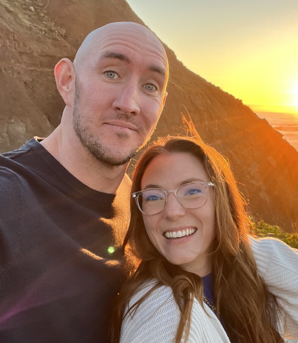
                We're Jason and Caroline. We've been solopreneurs for 10+ years. It feels like the demands
                on our time to create content to market our businesses have increased exponentially.
              </p>
              <p style={{ margin: 0 }}>
                AI promises to give us the power to keep up, but we found ourselves managing multiple
                disorganized chats, with AI that needed us to re-upload context and memory time and time again.
                We just wanted one place to turn our ideas into formatted, ready-to-post content,
                explaining our business and voice ONCE.
              </p>
              <p style={{ margin: 0 }}>
                So we built The Solo Content Studio. Ten specialists, trained once, running forever.
                This is the tool we wish we'd had three years ago. <em style={{ color: "var(--ink)", fontSize: "1.08em" }}>I think you'll feel the same way.</em>
              </p>
              <p style={{
                margin: "8px 0 0",
                fontFamily: "var(--font-emphasis)", fontStyle: "italic",
                fontSize: 22, color: "var(--orange)", lineHeight: 1.2,
              }}>
                With love,<br />Caroline &amp; Jason
              </p>
            </div>
          </div>
        </div>
      </div>
    </section>
  );
};

// ── COHORT BENEFITS ─────────────────────────────────────────
window.CohortBenefits = function CohortBenefits() {
  // Card scaffolding — light-mode cards on a warm gradient frame.
  // Illustration sits in its own padded zone above the content; visual height
  // is fixed so the text on each card starts at the same y position.
  // Card wrapper — base structure shared across all 3 cards.
  const cardWrapBase = {
    border: "1px solid hsl(12 50% 86%)",
    borderRadius: 22,
    display: "flex", flexDirection: "column",
    overflow: "hidden",
    boxShadow: "0 18px 48px hsl(345 58% 4% / 0.32)",
  };
  // Per-card warm cream backdrop with a unique pastel blur in the upper-right.
  const cardBgWith = (corner) => ({
    background: `
      radial-gradient(ellipse 75% 65% at 100% 0%, ${corner} 0%, transparent 62%),
      radial-gradient(ellipse 70% 70% at 0% 100%, hsl(12 70% 93% / 0.5) 0%, transparent 55%),
      var(--cream)
    `,
  });
  // Pastel corner colors (light) and matching mid-tone for illustration accents.
  const accents = {
    iris: { corner: "hsl(258 65% 88% / 0.95)", mid: "hsl(258 48% 68%)" },
    sage: { corner: "hsl(165 50% 86% / 0.95)", mid: "hsl(165 36% 60%)" },
    pink: { corner: "hsl(340 75% 90% / 0.95)", mid: "hsl(340 60% 72%)" },
  };
  // Content sits on top, illustration at the bottom — visual heights stay
  // locked so all 3 illustrations land at the same y-coordinate.
  const cardContent = {
    padding: "30px 28px 18px",
    display: "flex", flexDirection: "column", gap: 12, flex: 1,
  };
  const cardVisualWrap = {
    padding: "0 18px 18px",
    flexShrink: 0,
  };
  const cardVisualBox = {
    height: 196,
    display: "flex", flexDirection: "column",
    background: "var(--white)",
    border: "1px solid var(--border)",
    borderRadius: 12,
    overflow: "hidden",
    boxShadow: "0 8px 22px hsl(345 58% 4% / 0.12)",
  };
  // The new top-of-card label — Advercase display, the dominant text element
  const labelStyle = {
    fontFamily: "var(--font-display)", fontWeight: 400,
    fontSize: 28, color: "var(--ink)",
    letterSpacing: "-0.015em", lineHeight: 1.05,
    margin: 0,
  };
  // The card's body title — Pontano Sans bold, intentionally quieter than the label
  const titleStyle = {
    fontFamily: "var(--font-body)", fontWeight: 700,
    fontSize: 16.5, color: "var(--ink)",
    letterSpacing: "-0.005em", lineHeight: 1.4,
    margin: 0,
  };
  const bodyStyle = {
    fontSize: 14.5, color: "var(--ink-light)",
    lineHeight: 1.6, margin: 0,
  };

  // Shared chrome bar for visual consistency across cards
  const chromeBar = {
    flexShrink: 0,
    display: "flex", alignItems: "center", gap: 6,
    padding: "8px 12px",
    background: "var(--snow)",
    borderBottom: "1px solid var(--border)",
  };
  const chromeDot = { width: 8, height: 8, borderRadius: "50%", background: "hsl(350 10% 82%)" };
  const chromeLabel = {
    marginLeft: 8,
    fontFamily: "var(--font-mono)", fontSize: 9.5,
    letterSpacing: "0.14em", textTransform: "uppercase",
    color: "var(--muted)", fontWeight: 600,
  };

  // 12-month lock visual — first 2 free, next 10 at $49 (6 cols x 2 rows)
  const monthLabels = ["May", "Jun", "Jul", "Aug", "Sep", "Oct", "Nov", "Dec", "Jan", "Feb", "Mar", "Apr"];

  return (
    <section className="scs-cohort-section" style={{
      padding: "120px 32px", background: "var(--ink-deep)",
      color: "var(--white)", position: "relative", overflow: "hidden",
    }}>
      <style>{`
        @media (max-width: 980px) {
          .scs-cohort-grid {
            grid-template-columns: 1fr !important;
            max-width: 460px;
            margin: 0 auto;
          }
        }
        @media (max-width: 640px) {
          .scs-cohort-section { padding: 80px 18px !important; }
        }
      `}</style>
      <div style={{
        position: "absolute", inset: 0, pointerEvents: "none",
        background: "radial-gradient(ellipse 60% 50% at 80% 10%, hsl(12 72% 55% / 0.22), transparent 60%), radial-gradient(ellipse 50% 60% at 15% 90%, hsl(340 70% 55% / 0.14), transparent 60%)",
      }} />
      <div style={{ position: "relative", maxWidth: 1200, margin: "0 auto" }}>
        <div style={{ textAlign: "center", marginBottom: 64, maxWidth: 820, marginInline: "auto" }}>
          <window.Eyebrow style={{ marginBottom: 14, color: "var(--orange)" }}>
            What you get as a founding member
          </window.Eyebrow>
          <h2 style={{
            fontSize: "clamp(38px, 5vw, 64px)",
            color: "var(--white)", lineHeight: 1.02,
            letterSpacing: "-0.025em", margin: "0 0 20px",
          }}>
            Don't build your Studio <em>alone.</em>
          </h2>
          <p style={{
            fontFamily: "var(--font-emphasis)", fontStyle: "italic",
            fontSize: 20, lineHeight: 1.45,
            color: "hsl(350 15% 82%)",
            maxWidth: 720, margin: "0 auto",
          }}>
            A live cohort and private community of solopreneurs building right alongside you,
            plus 12 months of Pro features locked in at the founding rate.
          </p>
        </div>

        <div className="scs-cohort-grid" style={{
          display: "grid",
          gridTemplateColumns: "repeat(3, 1fr)",
          gap: 18, alignItems: "stretch",
        }}>

            {/* Card 1 — Solo Studio Live */}
            <div className="scs-cohort-card scs-reveal" style={{ ...cardWrapBase, ...cardBgWith(accents.iris.corner), "--scs-delay": "0ms" }}>
              {/* Content (top) */}
              <div style={cardContent}>
                <h3 style={labelStyle}>Live Cohort Event</h3>
                <div style={titleStyle}>
                  We'll walk you through Solo Content Studio, then we'll help you build yours live.
                </div>
                <p style={bodyStyle}>
                  Zoom call with us and the founding cohort. We open up a fully trained
                  Studio and walk you through it step-by-step. You'll watch us train
                  specialists from scratch and then we'll help you train yours. There
                  will be plenty of time for Q&amp;A. If you can't make it live we'll
                  have a recording available.
                </p>
                <div style={{
                  display: "inline-flex", alignItems: "center", gap: 10,
                  fontFamily: "var(--font-emphasis)", fontStyle: "italic",
                  fontSize: 15, color: "var(--orange-deep)", lineHeight: 1.3,
                  marginTop: 4,
                }}>
                  <span style={{ width: 6, height: 6, borderRadius: "50%", background: "var(--orange)" }} />
                  Thursday, May 14 · 2 hours on Zoom
                </div>
              </div>

              {/* Zoom-call mockup (bottom) */}
              <div style={cardVisualWrap}>
                <div style={cardVisualBox}>
                  <div style={chromeBar}>
                    <span style={chromeDot} />
                    <span style={chromeDot} />
                    <span style={chromeDot} />
                    <span style={chromeLabel}>Zoom · Solo Studio Live</span>
                    <span style={{
                      marginLeft: "auto",
                      display: "inline-flex", alignItems: "center", gap: 5,
                      fontFamily: "var(--font-mono)", fontSize: 9,
                      letterSpacing: "0.18em", textTransform: "uppercase",
                      color: "hsl(0 70% 60%)", fontWeight: 700,
                    }}>
                      <span style={{
                        width: 6, height: 6, borderRadius: "50%",
                        background: "hsl(0 70% 55%)",
                        boxShadow: "0 0 0 2px hsl(0 70% 55% / 0.3)",
                      }} />
                      Live
                    </span>
                  </div>
                  <div style={{
                    flex: 1,
                    padding: 14,
                    display: "grid", gridTemplateColumns: "1fr 1fr", gap: 10,
                    background: "linear-gradient(135deg, hsl(355 12% 99%), hsl(355 12% 96%))",
                  }}>
                    {[
                      { src: "assets/founders/caroline.jpg", name: "Caroline" },
                      { src: "assets/founders/jason.jpg",    name: "Jason"    },
                    ].map((p) => (
                      <div key={p.name} style={{
                        borderRadius: 8,
                        position: "relative",
                        overflow: "hidden",
                      }}>
                        <img
                          src={p.src}
                          alt={p.name}
                          style={{
                            width: "100%", height: "100%",
                            objectFit: "cover", display: "block",
                          }}
                        />
                        <span style={{
                          position: "absolute", left: 6, bottom: 5,
                          fontFamily: "var(--font-mono)", fontSize: 9,
                          letterSpacing: "0.1em", textTransform: "uppercase",
                          color: "var(--ink)", fontWeight: 600,
                          background: "hsl(0 0% 100% / 0.85)",
                          padding: "2px 6px", borderRadius: 3,
                        }}>{p.name}</span>
                      </div>
                    ))}
                  </div>
                </div>
              </div>
            </div>

            {/* Card 2 — In-app community */}
            <div className="scs-cohort-card scs-reveal" style={{ ...cardWrapBase, ...cardBgWith(accents.sage.corner), "--scs-delay": "80ms" }}>
              {/* Content (top) */}
              <div style={cardContent}>
                <h3 style={labelStyle}>In-App Community</h3>
                <div style={titleStyle}>
                  You won't be doing this alone. Access to us and other cohort members for two months.
                </div>
                <p style={bodyStyle}>
                  A private community for the founding cohort, right inside the app.
                  No Slack to switch to, no Discord to join. Open the Community tab,
                  share what's working in your studio, borrow what's working in
                  someone else's. The opposite of figuring it out alone in a Notion doc.
                </p>
              </div>

              {/* In-app community mockup (bottom) */}
              <div style={cardVisualWrap}>
                <div style={cardVisualBox}>
                  <div style={chromeBar}>
                    <span style={chromeDot} />
                    <span style={chromeDot} />
                    <span style={chromeDot} />
                    <span style={chromeLabel}>The Solo Content Studio</span>
                  </div>
                  <div style={{
                    display: "flex", gap: 14,
                    padding: "10px 14px 0",
                    borderBottom: "1px solid var(--border)",
                    fontFamily: "var(--font-mono)", fontSize: 10.5,
                    letterSpacing: "0.08em", textTransform: "uppercase",
                    flexShrink: 0,
                  }}>
                    {["Drafts", "Specialists", "Brand", "Community"].map((tab) => {
                      const active = tab === "Community";
                      return (
                        <span key={tab} style={{
                          padding: "0 0 8px",
                          color: active ? "var(--orange)" : "var(--muted)",
                          fontWeight: active ? 700 : 500,
                          borderBottom: active ? "2px solid var(--orange)" : "2px solid transparent",
                          marginBottom: -1,
                        }}>{tab}</span>
                      );
                    })}
                  </div>
                  <div style={{
                    flex: 1,
                    padding: "12px 14px 14px",
                    display: "flex", flexDirection: "column", gap: 10,
                    overflow: "hidden",
                  }}>
                    <div style={{
                      fontFamily: "var(--font-mono)", fontSize: 9.5,
                      letterSpacing: "0.16em", textTransform: "uppercase",
                      color: "var(--muted)", fontWeight: 600,
                    }}>
                      Founding cohort · 78 online
                    </div>
                    {[
                      { who: "Mira", when: "2m", body: "I generated my first newsletter draft. Holy cow!!" },
                      { who: "Sam",  when: "18m", body: "How are you all training your blog specialist?" },
                    ].map((post) => (
                      <div key={post.who} style={{ display: "flex", gap: 10, alignItems: "flex-start" }}>
                        <span style={{
                          width: 22, height: 22, borderRadius: "50%",
                          background: post.who === "Mira" ? "var(--orange)" : accents.sage.mid,
                          color: "var(--white)",
                          fontFamily: "var(--font-mono)", fontSize: 10, fontWeight: 700,
                          display: "inline-flex", alignItems: "center", justifyContent: "center",
                          flexShrink: 0,
                        }}>{post.who[0]}</span>
                        <div style={{ minWidth: 0, flex: 1 }}>
                          <div style={{ fontSize: 11.5, color: "var(--ink-light)", lineHeight: 1.3 }}>
                            <strong style={{ color: "var(--ink)", fontWeight: 600 }}>{post.who}</strong>
                            <span style={{ color: "var(--muted)", marginLeft: 6 }}>{post.when}</span>
                          </div>
                          <div style={{
                            fontSize: 12, color: "var(--ink-light)",
                            lineHeight: 1.4, marginTop: 2,
                            overflow: "hidden", textOverflow: "ellipsis", whiteSpace: "nowrap",
                          }}>
                            {post.body}
                          </div>
                        </div>
                      </div>
                    ))}
                  </div>
                </div>
              </div>

            </div>

            {/* Card 3 — The deal */}
            <div className="scs-cohort-card scs-reveal" style={{ ...cardWrapBase, ...cardBgWith(accents.pink.corner), "--scs-delay": "160ms" }}>
              {/* Content (top) */}
              <div style={cardContent}>
                <h3 style={labelStyle}>The Founding Deal</h3>
                <div style={titleStyle}>
                  Two free months on us, plus 12 months of Pro locked at the founding rate.
                </div>
                <p style={bodyStyle}>
                  Pay nothing for two months while you train your studio. After that,
                  $49/mo for 12 months while you stay active. That's $1,800 less than
                  the Pro rate ($199/mo) over the year, locked in. Cancel anytime.
                </p>
              </div>

              {/* 12-month rate-lock visual (bottom) */}
              <div style={cardVisualWrap}>
                <div style={cardVisualBox}>
                  <div style={chromeBar}>
                    <span style={chromeDot} />
                    <span style={chromeDot} />
                    <span style={chromeDot} />
                    <span style={chromeLabel}>Founding seat · No. 001</span>
                  </div>
                  <div style={{
                    flex: 1,
                    padding: "12px 14px",
                    display: "flex", flexDirection: "column",
                    background: "linear-gradient(135deg, hsl(355 12% 99%), hsl(355 12% 96%))",
                  }}>
                    <div style={{
                      fontFamily: "var(--font-mono)", fontSize: 9.5,
                      letterSpacing: "0.16em", textTransform: "uppercase",
                      color: "var(--muted)", fontWeight: 600,
                      marginBottom: 8,
                    }}>
                      12-month rate lock
                    </div>
                    <div style={{
                      flex: 1,
                      display: "grid",
                      gridTemplateColumns: "repeat(6, 1fr)",
                      gridAutoRows: "1fr",
                      gap: 6,
                    }}>
                      {monthLabels.map((m, idx) => {
                        const free = idx < 2;
                        return (
                          <div key={m} style={{
                            borderRadius: 5,
                            background: free ? "var(--orange)" : "hsl(355 10% 95%)",
                            border: free ? "1px solid var(--orange)" : "1px solid var(--border)",
                            display: "flex", flexDirection: "column",
                            alignItems: "center", justifyContent: "center",
                            gap: 1,
                          }}>
                            <span style={{
                              fontFamily: "var(--font-mono)",
                              fontSize: free ? 9 : 10,
                              fontWeight: 700,
                              color: free ? "var(--white)" : "var(--ink-light)",
                              letterSpacing: free ? "0.08em" : "0",
                              lineHeight: 1,
                            }}>
                              {free ? "FREE" : "$49"}
                            </span>
                            <span style={{
                              fontFamily: "var(--font-mono)", fontSize: 8,
                              letterSpacing: "0.1em", textTransform: "uppercase",
                              color: free ? "hsl(12 70% 94%)" : "var(--muted)",
                              fontWeight: 500, lineHeight: 1,
                            }}>{m}</span>
                          </div>
                        );
                      })}
                    </div>
                    <div style={{
                      marginTop: 8, paddingTop: 7,
                      borderTop: "1px dashed var(--border)",
                      display: "flex", justifyContent: "space-between", alignItems: "baseline",
                      fontFamily: "var(--font-mono)", fontSize: 9.5,
                      letterSpacing: "0.12em", textTransform: "uppercase",
                      color: "var(--muted)", fontWeight: 600,
                    }}>
                      <span>Pro rate $199/mo</span>
                      <span style={{ color: accents.pink.mid }}>You save $1,800/yr</span>
                    </div>
                  </div>
                </div>
              </div>

            </div>

          </div>
        </div>
      </section>
    );
};

// ── PRICING ─────────────────────────────────────────────────
// All variable copy (price, urgency text, CTA, etc.) reads from
// window.SCS_PHASE which is set in index.html based on the current
// UTC clock. Phase auto-flips at:
//   - Mon May 4 00:00 PT  (week1 → week2: $295 → $395)
//   - Mon May 11 00:00 PT (week2 → closed)
// To force a phase locally for testing:
//   localStorage.setItem("SCS_PHASE_OVERRIDE", "week2"); location.reload();
window.PricingSection = function PricingSection() {
  const phase = window.SCS_PHASE || {};
  const tier = phase.tier;
  const stripeHref = (tier && window.STRIPE_LINKS?.[tier]) || "#";
  const isPlaceholder = stripeHref === "#" || stripeHref.startsWith("#TODO");
  const c = window.useCountdown();
  const isExpired = phase.mode === "expired";

  // Post-cohort phase: render the 3-tier pricing grid (Trial / Standard /
  // Pro). Founding cohort has wrapped up; the page now sells subscriptions.
  if (phase.mode === "post-cohort") {
    return <PostCohortPricingSection />;
  }

  // Expired bridge: render only the ticket card (no tier comparison, no
  // bundle close, no launch foot). Ticket stays visible so the page still
  // communicates what the cohort *was*; CTA + price stamp swap to a clear
  // "Joining the cohort has expired" treatment.
  if (isExpired) {
    return <ExpiredPricingSection phase={phase} c={c} />;
  }

  return (
    <section id="pricing" className="scs-launch-section">
      <style>{`
        .scs-launch-section {
          padding: 96px 32px 96px;
          position: relative;
          overflow: hidden;
          background:
            radial-gradient(ellipse 60% 55% at 20% 15%, hsl(12 72% 92% / 0.85) 0%, transparent 55%),
            radial-gradient(ellipse 55% 60% at 80% 80%, hsl(38 80% 90% / 0.6) 0%, transparent 55%),
            var(--snow);
        }
        .scs-launch-section * { box-sizing: border-box; }
        .scs-launch-section .launch-inner { max-width: 780px; margin: 0 auto; position: relative; z-index: 1; }
        .scs-launch-section .launch-hero { text-align: center; margin-bottom: 48px; }

        .scs-launch-section .urgency-chip {
          display: inline-flex; align-items: center; gap: 10px;
          background: var(--ink); color: var(--white);
          padding: 10px 20px; border-radius: 999px;
          font-family: var(--font-mono); font-size: 11px; letter-spacing: .16em;
          text-transform: uppercase; font-weight: 600;
          margin-bottom: 24px;
        }
        .scs-launch-section .urgency-chip .pulse {
          width: 8px; height: 8px; border-radius: 50%; background: var(--orange);
          box-shadow: 0 0 0 0 hsl(12 72% 55% / 0.7);
          animation: scsUrgencyPulse 2s infinite;
        }
        @keyframes scsUrgencyPulse {
          0%   { box-shadow: 0 0 0 0 hsl(12 72% 55% / 0.7); }
          70%  { box-shadow: 0 0 0 10px hsl(12 72% 55% / 0); }
          100% { box-shadow: 0 0 0 0 hsl(12 72% 55% / 0); }
        }
        .scs-launch-section .urgency-chip .sep { opacity: .5; }

        .scs-launch-section .launch-hero h2 {
          font-family: var(--font-display); font-weight: 400;
          font-size: clamp(44px, 5.6vw, 68px); line-height: 1;
          letter-spacing: -.025em; color: var(--ink);
          margin: 0 0 16px;
        }
        .scs-launch-section .launch-hero .lede {
          font-family: var(--font-emphasis); font-style: italic;
          font-size: 19px; line-height: 1.4; color: var(--ink-light);
          max-width: 560px; margin: 0 auto;
        }

        .scs-launch-section .ticket-wrapper { max-width: 540px; margin: 0 auto 40px; }
        .scs-launch-section .ticket-card {
          background: var(--ink); color: var(--white);
          border-radius: 24px; padding: 36px 32px 28px;
          box-shadow: 0 20px 60px hsl(345 58% 12% / 0.35);
          display: flex; flex-direction: column;
          position: relative; overflow: hidden;
        }
        .scs-launch-section .ticket-card::before {
          content: ''; position: absolute; inset: 0; pointer-events: none;
          background:
            radial-gradient(ellipse 70% 50% at 80% 10%, hsl(12 72% 55% / 0.22) 0%, transparent 55%),
            radial-gradient(ellipse 60% 45% at 10% 95%, hsl(38 80% 60% / 0.10) 0%, transparent 55%);
        }
        .scs-launch-section .ticket-card > * { position: relative; z-index: 1; }
        .scs-launch-section .t-label-row {
          display: flex; justify-content: space-between; align-items: center;
          margin-bottom: 22px;
        }
        .scs-launch-section .t-label {
          font-family: var(--font-mono); font-size: 10.5px; letter-spacing: .16em;
          text-transform: uppercase; color: var(--orange); font-weight: 600;
        }
        .scs-launch-section .t-stub {
          font-family: var(--font-mono); font-size: 9.5px; letter-spacing: .22em;
          text-transform: uppercase; color: hsl(350, 15%, 55%); font-weight: 500;
          border: 1px solid hsl(350, 15%, 28%);
          padding: 3px 10px; border-radius: 4px;
        }
        .scs-launch-section .t-event { padding-bottom: 18px; margin-bottom: 4px; }
        .scs-launch-section .t-date {
          font-family: var(--font-display); font-weight: 400;
          font-size: 38px; line-height: 1; letter-spacing: -.02em;
          color: var(--white); margin-bottom: 6px;
        }
        .scs-launch-section .t-date em {
          font-family: var(--font-emphasis); font-style: italic;
          color: var(--orange); font-size: 1.1em;
        }
        .scs-launch-section .t-meta {
          font-family: var(--font-emphasis); font-style: italic;
          font-size: 16px; color: hsl(350, 15%, 75%);
        }
        .scs-launch-section .t-price-stamp {
          padding: 22px 32px 16px; margin: 6px -32px 4px;
          text-align: center;
          border-top: 1px dashed hsl(350, 15%, 24%);
          border-bottom: 1px dashed hsl(350, 15%, 24%);
          background: hsl(345 58% 10%);
        }
        .scs-launch-section .t-price-label {
          font-family: var(--font-mono); font-size: 10px; letter-spacing: .22em;
          text-transform: uppercase; color: hsl(350, 15%, 60%); font-weight: 600;
          display: block; margin-bottom: 16px;
        }
        .scs-launch-section .t-price-amount {
          font-family: var(--font-display); font-weight: 400;
          font-size: 68px; line-height: .9; letter-spacing: -.02em;
          color: var(--white);
        }
        .scs-launch-section .t-price-savings {
          margin-top: 16px;
          display: inline-flex; align-items: center;
          gap: 10px; flex-wrap: wrap; justify-content: center;
        }
        .scs-launch-section .t-price-was-prefix {
          font-family: var(--font-mono); font-size: 10px;
          letter-spacing: .2em; text-transform: uppercase;
          color: hsl(350, 15%, 62%); font-weight: 600;
        }
        .scs-launch-section .t-price-was {
          position: relative; display: inline-block;
          font-family: var(--font-display); font-weight: 400;
          font-size: 24px; line-height: 1;
          color: hsl(350, 15%, 75%);
          letter-spacing: -.01em;
        }
        .scs-launch-section .t-price-was::after {
          content: ''; position: absolute;
          left: -3px; right: -3px; top: 50%; height: 2.5px;
          background: var(--orange); opacity: 1;
          transform: rotate(-6deg) translateY(-1px);
          box-shadow: 0 1px 0 hsl(345 58% 8%);
        }
        .scs-launch-section .t-price-save-chip {
          font-family: var(--font-mono); font-style: normal;
          font-size: 11.5px; letter-spacing: .14em; text-transform: uppercase;
          font-weight: 700;
          color: var(--white); background: var(--orange);
          padding: 6px 11px; border-radius: 6px;
          box-shadow: 0 4px 14px hsl(12 72% 40% / 0.5);
        }
        .scs-launch-section .t-countdown-line {
          margin-top: 14px;
          display: inline-flex;
          align-items: center;
          gap: 10px;
          flex-wrap: wrap;
          justify-content: center;
        }
        .scs-launch-section .t-countdown-label {
          font-family: var(--font-mono);
          font-size: 9.5px;
          letter-spacing: 0.18em;
          text-transform: uppercase;
          color: hsl(350 15% 58%);
          font-weight: 600;
        }
        .scs-launch-section .t-countdown-time {
          font-family: var(--font-body);
          font-weight: 500;
          font-size: 13px;
          color: hsl(350 15% 80%);
          font-variant-numeric: tabular-nums;
          display: inline-flex;
          align-items: center;
          gap: 5px;
        }
        .scs-launch-section .t-countdown-time .dot {
          color: var(--orange);
          opacity: 0.55;
        }
        .scs-launch-section .t-perforation {
          height: 1px;
          background-image: linear-gradient(to right, hsl(350, 15%, 35%) 50%, transparent 50%);
          background-size: 10px 1px;
          margin: 20px 0 20px;
          position: relative;
        }
        .scs-launch-section .t-perforation::before,
        .scs-launch-section .t-perforation::after {
          content: ''; position: absolute; top: -9px;
          width: 18px; height: 18px; border-radius: 50%;
          background: var(--snow);
        }
        .scs-launch-section .t-perforation::before { left: -42px; }
        .scs-launch-section .t-perforation::after  { right: -42px; }
        .scs-launch-section .t-details-label {
          font-family: var(--font-mono); font-size: 10px; letter-spacing: .16em;
          text-transform: uppercase; color: hsl(350, 15%, 58%); font-weight: 600;
          margin-bottom: 14px;
        }
        .scs-launch-section .t-details {
          list-style: none; padding: 0; margin: 0;
          display: flex; flex-direction: column; gap: 13px; flex: 1;
        }
        .scs-launch-section .t-details li {
          font-size: 16px; line-height: 1.5;
          padding-left: 32px; position: relative;
          color: hsl(350, 15%, 82%);
        }
        .scs-launch-section .t-details li::before {
          content: '✓';
          position: absolute; left: 0; top: 2px;
          width: 22px; height: 22px; border-radius: 50%;
          background: hsl(12 72% 55% / 0.18); color: var(--orange);
          font-family: var(--font-body); font-size: 13px; font-weight: 700;
          display: flex; align-items: center; justify-content: center;
          line-height: 1;
        }
        .scs-launch-section .t-included {
          margin-top: 20px; padding-top: 14px;
          border-top: 1px dashed hsl(350, 15%, 22%);
          font-family: var(--font-mono); font-size: 10px; letter-spacing: .18em;
          text-transform: uppercase; color: var(--orange); font-weight: 600;
          text-align: center;
        }
        .scs-launch-section .t-cta {
          display: inline-flex; align-self: center;
          align-items: center; justify-content: center; gap: 10px;
          margin-top: 20px;
          padding: 18px 32px; border-radius: 999px;
          background: var(--orange); color: var(--white);
          font-family: var(--font-display); font-size: 19px;
          text-decoration: none; letter-spacing: -.01em;
          box-shadow: 0 12px 28px hsl(12 72% 40% / 0.42);
          transition: transform .2s ease, background .2s ease;
          border: none; cursor: pointer;
        }
        .scs-launch-section .t-cta:hover {
          transform: translateY(-2px);
          background: var(--orange-deep);
          color: var(--white);
        }
        .scs-launch-section .t-cta .cta-price {
          font-family: var(--font-display);
          font-size: 19px; opacity: .85;
        }
        .scs-launch-section .t-cta .cta-price::before {
          content: '·'; margin-right: 8px; opacity: .6;
        }

        /* Tier comparison */
        .scs-launch-section .tier-comparison {
          display: grid; grid-template-columns: 1fr 1fr; gap: 18px;
          max-width: 760px; margin: 0 auto 36px;
          align-items: stretch; padding-top: 14px;
        }
        .scs-launch-section .tier-card {
          background: var(--white);
          border: 1px solid var(--border);
          border-radius: 22px;
          padding: 32px 26px;
          display: flex; flex-direction: column;
          position: relative; overflow: hidden;
        }
        .scs-launch-section .tier-card.founding {
          background: linear-gradient(180deg, var(--white) 0%, hsl(12 70% 98%) 100%);
          border: 1.5px solid hsl(12 60% 82%);
          padding: 28px 22px;
          box-shadow: 0 20px 50px hsl(12 72% 40% / 0.15);
        }
        .scs-launch-section .tier-card.greyed {
          background: hsl(355 8% 97%);
          border: 1px solid hsl(350 10% 90%);
          padding: 28px 22px;
          opacity: .78;
          transition: opacity .2s ease;
        }
        .scs-launch-section .tier-card.greyed:hover { opacity: .92; }

        .scs-launch-section .tier-card .card-band {
          margin: -28px -22px 22px;
          padding: 18px 22px 16px;
          text-align: center;
        }
        .scs-launch-section .tier-card.founding .card-band {
          background: var(--orange-light);
          border-bottom: 1px solid hsl(12 60% 86%);
        }
        .scs-launch-section .tier-card.greyed .card-band {
          background: hsl(350 10% 90%);
          border-bottom: 1px solid hsl(350 10% 84%);
        }
        .scs-launch-section .tier-card .card-band .band-headline {
          font-family: var(--font-body); font-weight: 600;
          font-size: 17px; line-height: 1.2; letter-spacing: -.005em;
          margin-bottom: 4px;
        }
        .scs-launch-section .tier-card.founding .card-band .band-headline { color: var(--orange-deep); }
        .scs-launch-section .tier-card.greyed .card-band .band-headline { color: var(--ink-light); }
        .scs-launch-section .tier-card .card-band .band-sub {
          font-family: var(--font-emphasis); font-style: italic;
          font-size: 14px; line-height: 1.35;
        }
        .scs-launch-section .tier-card.founding .card-band .band-sub { color: var(--ink-light); }
        .scs-launch-section .tier-card.greyed .card-band .band-sub { color: hsl(350, 15%, 48%); }

        /* Plan qualifier (mono small caps) — sits below the plan name */
        .scs-launch-section .tier-card .tier-label {
          font-family: var(--font-mono); font-size: 10px; letter-spacing: .16em;
          text-transform: uppercase; font-weight: 600;
          display: block; margin-bottom: 16px;
        }
        .scs-launch-section .tier-card.founding .tier-label { color: var(--orange); }
        .scs-launch-section .tier-card.greyed .tier-label { color: var(--muted); }

        /* Plan name (display serif) — prominent, sits on top */
        .scs-launch-section .tier-card .tier-name {
          font-family: var(--font-display); font-weight: 400;
          font-size: 28px; line-height: 1.05; letter-spacing: -.015em;
          margin-bottom: 4px;
        }
        .scs-launch-section .tier-card.founding .tier-name { color: var(--ink); }
        .scs-launch-section .tier-card.greyed .tier-name { color: var(--ink-light); }

        .scs-launch-section .tier-card .tier-price-line {
          font-family: var(--font-display); font-weight: 400;
          font-size: 38px; line-height: .9; letter-spacing: -.02em;
          margin-bottom: 4px;
        }
        .scs-launch-section .tier-card.founding .tier-price-line { color: var(--orange); }
        .scs-launch-section .tier-card.greyed .tier-price-line { color: var(--ink-light); }
        .scs-launch-section .tier-card .tier-price-line .unit {
          font-family: var(--font-emphasis); font-style: italic;
          font-size: 17px; margin-left: 4px;
        }
        .scs-launch-section .tier-card.founding .tier-price-line .unit { color: var(--ink-light); }
        .scs-launch-section .tier-card.greyed .tier-price-line .unit { color: var(--muted); }

        .scs-launch-section .tier-card .tier-price-note {
          font-size: 14px; margin-bottom: 4px;
        }
        .scs-launch-section .tier-card.founding .tier-price-note { color: var(--ink-light); }
        .scs-launch-section .tier-card.greyed .tier-price-note { color: var(--muted); }
        .scs-launch-section .tier-card .tier-price-compare {
          font-family: var(--font-emphasis); font-style: italic;
          font-size: 13px; line-height: 1.35;
          color: hsl(350, 12%, 50%);
          margin: 0 0 16px;
        }

        /* Founding savings callout — lead with the year-1 dollar number */
        .scs-launch-section .tier-card.founding .tier-savings {
          margin: 6px 0 18px;
          padding: 12px 14px;
          background: var(--orange-light);
          border: 1px solid hsl(12 70% 78%);
          border-radius: 12px;
          display: flex; flex-direction: column; gap: 4px;
        }
        .scs-launch-section .tier-card.founding .tier-savings .savings-amount {
          font-family: var(--font-display);
          font-weight: 400;
          font-size: 30px;
          line-height: 1;
          letter-spacing: -.02em;
          color: var(--orange-deep);
        }
        .scs-launch-section .tier-card.founding .tier-savings .savings-amount em {
          font-family: var(--font-emphasis);
          font-style: italic;
          font-weight: 400;
          font-size: 22px;
          color: var(--orange);
          margin-left: 4px;
        }
        .scs-launch-section .tier-card.founding .tier-savings .savings-detail {
          font-family: var(--font-mono);
          font-size: 11px;
          letter-spacing: 0.06em;
          color: var(--ink-light);
          margin: 0;
        }
        .scs-launch-section .tier-card.founding .tier-savings .savings-old {
          text-decoration: line-through;
          color: var(--muted);
          margin-right: 6px;
        }
        .scs-launch-section .tier-card.founding .tier-savings .savings-arrow {
          color: var(--orange);
          margin-right: 6px;
          font-weight: 700;
        }
        .scs-launch-section .tier-card.founding .tier-savings .savings-new {
          color: var(--ink);
          font-weight: 700;
        }

        /* Annual total under the Pro card price, sets up the contrast */
        .scs-launch-section .tier-card.greyed .tier-price-annual {
          font-family: var(--font-mono);
          font-size: 11px;
          letter-spacing: 0.08em;
          color: var(--muted);
          margin: 0 0 14px;
        }

        .scs-launch-section .tier-card .tier-features {
          list-style: none; padding: 0; margin: 0 0 16px;
          display: flex; flex-direction: column; gap: 12px; flex: 1;
        }
        .scs-launch-section .tier-card .tier-features li {
          font-size: 16px; line-height: 1.5;
          padding-left: 28px; position: relative;
          color: var(--ink-light);
        }
        .scs-launch-section .tier-card .tier-features li::before {
          content: '✓';
          position: absolute; left: 0; top: 3px;
          width: 20px; height: 20px; border-radius: 50%;
          font-family: var(--font-body); font-size: 12px; font-weight: 700;
          display: flex; align-items: center; justify-content: center;
          line-height: 1;
        }
        .scs-launch-section .tier-card.founding .tier-features li::before {
          background: var(--orange-light); color: var(--orange-deep);
        }
        .scs-launch-section .tier-card.greyed .tier-features li::before {
          background: hsl(350 10% 88%); color: var(--muted);
        }
        .scs-launch-section .tier-card .tier-features li strong { font-weight: 600; }
        .scs-launch-section .tier-card.founding .tier-features li strong { color: var(--ink); }
        .scs-launch-section .tier-card.greyed .tier-features li strong { color: var(--ink-light); }

        /* Bundle close */
        .scs-launch-section .bundle-close {
          max-width: 920px; margin: 0 auto;
          background: var(--white);
          border: 1px solid var(--border);
          border-radius: 20px;
          padding: 28px 32px;
          box-shadow: 0 10px 30px hsl(12 72% 40% / 0.06);
        }
        .scs-launch-section .also-included {
          display: grid; grid-template-columns: 1.3fr 1fr; gap: 40px;
          align-items: start;
          padding-bottom: 24px; margin-bottom: 22px;
          border-bottom: 1px dashed var(--border);
        }
        .scs-launch-section .ai-label {
          font-family: var(--font-mono); font-size: 10px; letter-spacing: .16em;
          text-transform: uppercase; color: var(--muted); font-weight: 600;
          display: block; margin-bottom: 16px;
        }
        .scs-launch-section .ai-items { display: flex; flex-direction: column; gap: 14px; }
        .scs-launch-section .ai-item { display: flex; align-items: flex-start; gap: 12px; }
        .scs-launch-section .ai-item .ai-check {
          flex-shrink: 0;
          width: 22px; height: 22px; border-radius: 50%;
          background: var(--orange-light); color: var(--orange-deep);
          display: flex; align-items: center; justify-content: center;
          font-size: 12px; font-weight: 700; margin-top: 1px;
        }
        .scs-launch-section .ai-text { display: flex; flex-direction: column; gap: 3px; }
        .scs-launch-section .ai-text strong {
          font-weight: 600; color: var(--ink);
          font-size: 16px; line-height: 1.3;
        }
        .scs-launch-section .ai-text .ai-note {
          font-weight: 400; color: var(--muted); font-size: 14px;
        }
        .scs-launch-section .ai-desc { font-size: 16px; line-height: 1.45; color: var(--ink-light); }

        /* Founding seal */
        .scs-launch-section .bundle-aside {
          display: flex; align-items: center; justify-content: center; padding: 8px 0;
        }
        .scs-launch-section .founding-portrait {
          width: 230px;
          height: auto;
          display: block;
          /* Subtle drop shadow so the framed character pops off the surface
             a little without competing with the surrounding card. */
          filter: drop-shadow(0 12px 28px hsl(12 72% 35% / 0.18));
          flex-shrink: 0;
        }

        /* CTA */
        .scs-launch-section .cta-row {
          display: flex; flex-direction: column; align-items: center; gap: 12px;
        }
        .scs-launch-section .bundle-cta {
          display: inline-flex; align-items: center; justify-content: center; gap: 10px;
          padding: 22px 44px; border-radius: 999px;
          background: var(--orange); color: var(--white);
          font-family: var(--font-display); font-size: 22px;
          text-decoration: none; letter-spacing: -.01em;
          box-shadow: 0 14px 32px hsl(12 72% 40% / 0.42);
          transition: transform .2s ease, background .2s ease;
          border: none; cursor: pointer;
        }
        .scs-launch-section .bundle-cta:hover {
          transform: translateY(-2px);
          background: var(--orange-deep);
          color: var(--white);
        }
        .scs-launch-section .bundle-cta .cta-price {
          font-family: var(--font-display);
          font-size: 22px; opacity: .85;
        }
        .scs-launch-section .bundle-cta .cta-price::before {
          content: '·'; margin-right: 8px; opacity: .6;
        }
        .scs-launch-section .cta-sub {
          font-family: var(--font-emphasis); font-style: italic;
          font-size: 14px; color: var(--muted); margin: 0;
        }

        .scs-launch-section .launch-foot {
          display: flex; justify-content: center; gap: 24px;
          margin-top: 24px; padding-top: 0;
          font-family: var(--font-mono); font-size: 10.5px;
          letter-spacing: .14em; text-transform: uppercase;
          color: var(--muted); font-weight: 500; text-align: center; flex-wrap: wrap;
        }
        .scs-launch-section .launch-foot .dot {
          width: 3px; height: 3px; border-radius: 50%;
          background: var(--border); align-self: center;
        }

        @media (max-width: 780px) {
          .scs-launch-section { padding: 64px 20px 72px; }
          .scs-launch-section .ticket-wrapper { max-width: 100%; }
          .scs-launch-section .tier-comparison {
            grid-template-columns: 1fr; gap: 14px; max-width: 420px;
          }
          .scs-launch-section .tier-card.greyed { display: none; }
          .scs-launch-section .tier-card.founding { padding: 24px 20px; }
          .scs-launch-section .tier-card .card-band {
            margin: -24px -20px 18px; padding: 14px 20px 12px;
          }
          .scs-launch-section .ticket-card { padding: 28px 24px; }
          .scs-launch-section .t-date { font-size: 30px; }
          .scs-launch-section .t-perforation::before,
          .scs-launch-section .t-perforation::after { display: none; }
          .scs-launch-section .t-cta {
            align-self: stretch;
            padding: 16px 24px; font-size: 17px;
          }
          .scs-launch-section .t-cta .cta-price { font-size: 17px; }
          .scs-launch-section .bundle-close { padding: 22px; }
          .scs-launch-section .also-included { grid-template-columns: 1fr; gap: 24px; }
          .scs-launch-section .bundle-cta { width: 100%; }
          .scs-launch-section .launch-foot { gap: 14px; }
        }
      `}</style>

      <div className="launch-inner">

        <div className="launch-hero scs-reveal">
          <div className="urgency-chip">
            <span className="pulse"></span>
            <span>{phase.urgencyHeader || "Early bird pricing ends Sun May 3"}</span>
          </div>
          <h2>The founding <em>bundle.</em></h2>
          <p className="lede">Your seat at Solo Studio Live, plus 12 months of Pro features locked in at the founding rate. Pay $49/mo instead of $199/mo, $1,800 less than the Pro rate over your first year.</p>
        </div>

        {/* Solo Studio Live ticket */}
        <div className="ticket-wrapper scs-reveal">
          <div className="ticket-card">
            <div className="t-label-row">
              <span className="t-label">Solo Studio Live Pass</span>
              <span className="t-stub">No. 001</span>
            </div>

            <div className="t-event">
              <div className="t-date">Thursday, <em>May 14</em></div>
              <div className="t-meta">2 hour live Zoom · With Caroline &amp; Jason</div>
            </div>

            <div className="t-price-stamp">
              <span className="t-price-label">{phase.priceLabel || "Early bird admission"}</span>
              <div className="t-price-amount">{phase.price || "$295"}</div>
              {phase.wasPrice && (
                <div className="t-price-savings">
                  <span className="t-price-was-prefix">Regular price</span>
                  <span className="t-price-was">{phase.wasPrice}</span>
                  {phase.saveAmount && (
                    <span className="t-price-save-chip">Save {phase.saveAmount}</span>
                  )}
                </div>
              )}
              <div className="t-countdown-line">
                <span className="t-countdown-label">{phase.countdownLabel || "Early bird ends in"}</span>
                <span className="t-countdown-time">
                  <span>{String(c.days).padStart(2, "0")}d</span>
                  <span className="dot">·</span>
                  <span>{String(c.hours).padStart(2, "0")}h</span>
                  <span className="dot">·</span>
                  <span>{String(c.mins).padStart(2, "0")}m</span>
                  <span className="dot">·</span>
                  <span>{String(c.secs).padStart(2, "0")}s</span>
                </span>
              </div>
            </div>

            <div className="t-perforation"></div>

            <span className="t-details-label">Your ticket includes</span>
            <ul className="t-details">
              <li>We show you a fully trained studio</li>
              <li>We train two specialists step-by-step</li>
              <li>We answer any questions you have</li>
              <li>HD recording included</li>
              <li>2 months free, then 12 months of Pro Plan at $49/mo (save $1,800/yr)</li>
            </ul>

            <div className="t-included">★ This is the best deal you'll ever see</div>

            {phase.soldOut ? (
              <a
                className="t-cta"
                href="#"
                onClick={(e) => e.preventDefault()}
                style={{ pointerEvents: "none", opacity: 0.55 }}
              >
                Cohort closed
              </a>
            ) : (
              <a
                className="t-cta"
                href={stripeHref}
                onClick={isPlaceholder ? (e) => { e.preventDefault(); console.warn("[TODO] wire Stripe link for founding bundle"); } : undefined}
              >
                Claim founding<span className="cta-price">{phase.ctaPrice || "$295"}</span>→
              </a>
            )}
          </div>
        </div>

        {/* Founding vs Standard */}
        <div className="tier-comparison scs-reveal">

          <div className="tier-card founding">
            <div className="card-band">
              <div className="band-headline">Your first 2 months · Free</div>
              <div className="band-sub">You won't start paying until 2 months after signup</div>
            </div>

            <div className="tier-name">Founding Plan</div>
            <span className="tier-label">Pro features locked in</span>

            <div className="tier-price-line">$49<span className="unit">/ mo</span></div>
            <p className="tier-price-note">Pro rate locked for 12 months</p>
            <div className="tier-savings">
              <div className="savings-amount">Save $1,800<em>over 12 months</em></div>
              <p className="savings-detail">
                <span className="savings-old">$2,388/yr Pro</span>
                <span className="savings-arrow">→</span>
                <span className="savings-new">$588/yr founding</span>
              </p>
            </div>

            <ul className="tier-features">
              <li>Full access to all <strong>10 specialists</strong></li>
              <li><strong>1,000 credits/month</strong> (≈ 60 drafts)</li>
              <li><strong>Drafting from your phone</strong> (Telegram)</li>
              <li><strong>Unlimited projects</strong> (Standard gets 2)</li>
              <li><strong>Export rights</strong> for all your training</li>
              <li>Top up extra credits anytime</li>
              <li>Cancel any time</li>
            </ul>
          </div>

          <div className="tier-card greyed">
            <div className="card-band">
              <div className="band-headline">What would you pay after May 10?</div>
              <div className="band-sub">No free months · First payment on day one</div>
            </div>

            <div className="tier-name">Pro Plan</div>
            <span className="tier-label">Full feature access</span>

            <div className="tier-price-line">$199<span className="unit">/ mo</span></div>
            <p className="tier-price-note">Cancel anytime · no setup fee</p>
            <p className="tier-price-annual">$2,388/year</p>

            <ul className="tier-features">
              <li>Full access to all 10 specialists</li>
              <li>1,000 credits/month, top up anytime</li>
              <li>Drafting from your phone (Telegram)</li>
              <li>Unlimited projects</li>
              <li>Export rights for all your training</li>
            </ul>
          </div>

        </div>

        {/* Bundle close */}
        <div className="bundle-close scs-reveal">

          <div className="also-included">
            <div className="items-col">
              <span className="ai-label">Also in the bundle</span>
              <div className="ai-items">
                <div className="ai-item">
                  <span className="ai-check">✓</span>
                  <div className="ai-text">
                    <strong>Unlimited content regeneration</strong>
                    <span className="ai-desc">Don't love a draft? You'll be able to regenerate your content until it's right. Founding members get unlimited content regenerations!</span>
                  </div>
                </div>
                <div className="ai-item">
                  <span className="ai-check">✓</span>
                  <div className="ai-text">
                    <strong>Studio Community access</strong>
                    <span className="ai-desc">In-app community with access to us and other cohort members to share content ideas and wins.</span>
                  </div>
                </div>
              </div>
            </div>

            <aside className="bundle-aside">
              <video
                className="founding-portrait"
                src="/pre-launch/assets/animations/hedgehog-wave.mp4"
                poster="/pre-launch/assets/animations/hedgehog-wave-poster.jpg"
                autoPlay
                loop
                muted
                playsInline
                disablePictureInPicture
                aria-label="Newsletter Editor specialist waving hello"
                /* React maps `muted` to a property, but autoplay only fires
                   if `muted` is also present as an HTML attribute. Force the
                   attribute, then call play() explicitly to bypass any browser
                   autoplay-policy edge cases (Safari low-power mode, etc).
                   The .play() promise will reject silently if blocked, which
                   is fine — autoplay attribute already set as fallback. */
                ref={(el) => {
                  if (!el) return;
                  el.setAttribute("muted", "");
                  el.play().catch(() => {});
                }}
              />
            </aside>
          </div>

          <div className="cta-row">
            {phase.soldOut ? (
              <a
                className="bundle-cta"
                href="#"
                onClick={(e) => e.preventDefault()}
                style={{ pointerEvents: "none", opacity: 0.55 }}
              >
                Cohort closed
              </a>
            ) : (
              <a
                className="bundle-cta"
                href={stripeHref}
                onClick={isPlaceholder ? (e) => { e.preventDefault(); console.warn("[TODO] wire Stripe link for founding bundle"); } : undefined}
              >
                Claim founding<span className="cta-price">{phase.ctaPrice || "$295"}</span>→
              </a>
            )}
            <p className="cta-sub">{phase.ctaSub || "One payment now. Then nothing for two months."}</p>
          </div>

        </div>

        <div className="launch-foot">
          <span>{phase.footerNote || "Early bird pricing ends Sun May 3"}</span>
          <span className="dot"></span>
          <span>You receive full access to the Studio May 11</span>
        </div>

      </div>
    </section>
  );
};

// ── FAQ ─────────────────────────────────────────────────────
window.FAQ = function FAQ() {
  const [openIdx, setOpenIdx] = React.useState(null);
  const phase = window.SCS_PHASE || {};
  const isPostCohort = phase.mode === "post-cohort";

  // Founding-cohort phase entries reference the May 11 launch, the live
  // cohort kickoff, and the $49/mo founding rate locked for 12 months.
  const qasFounding = [
    {
      q: "Will it actually sound like me?",
      a: "That's the whole point. Each specialist is trained on your voice through preference questions and writing samples. You'll refine it as you go, and every draft makes the next one sharper. If it doesn't sound like you by day 14, we refund you.",
    },
    {
      q: "When do I get access?",
      a: "You're pre-ordering. The Studio goes live for the founding cohort on May 11, and we'll send your login that morning. From there you'll set up your brand, train your specialists, and start generating drafts at your own pace. Solo Studio Live, our cohort kickoff, is Thursday May 14 on Zoom.",
    },
    {
      q: "Do I need to be good with AI to use this?",
      a: "No. The training flow is a handful of questions with real examples, not prompts to write. Most founding members are up and running in 30 minutes. If you can describe your audience out loud, you can train a specialist.",
    },
    {
      q: "How is this different from Jasper, Copyai, or just chatting with GPT, Claude, etc?",
      a: "Those are chat windows or template generators. The Studio is a layered system: your brand context is stored once, ten specialists read from it, and every draft lives in one searchable place. You're not prompting. You're directing.",
    },
    {
      q: "What AI is powering The Studio?",
      a: "Claude Opus 4.7, made by Anthropic (we're using the best model, no shortcuts). We picked it because it's the strongest writing model out right now and because Anthropic has the cleanest privacy stance among the major AI labs. The difference between The Studio and using Claude in a chat window is the system around it: ten specialists trained on your voice, your brand, and your formats, with every draft stored in one place.",
    },
    {
      q: "Do I need my own Claude or ChatGPT subscription?",
      a: "No. The Studio is fully self-contained. We pay for Claude Opus 4.7 (Anthropic's best model) as part of your subscription and meter usage with credits, so you don't need to bring an API key, sign up for Claude.ai, or keep a ChatGPT Plus seat on the side. Your $49/mo covers the model, the specialists, and everything in between.",
    },
    {
      q: "Is my content used to train AI?",
      a: "No. Anthropic doesn't train on customer prompts, and we don't train AI on your content either. Your drafts, your specialist training, and your Brand Kit stay yours. The only place your content lives is in your account, where you can edit, export, or delete it.",
    },
    {
      q: "What happens after I buy?",
      a: "You'll get an instant confirmation email with your founder welcome. The Studio goes live on May 11, and that morning we'll send your login. From there: about 30 minutes setting up your brand, 10 minutes training your first specialist, and you're generating drafts the same day. We'll see you on Zoom for Solo Studio Live on May 14, and the rest of the cohort is right inside the app.",
    },
    {
      q: "What will I pay after the first 12 months?",
      a: "Your $49/mo founding rate is locked for the full first year. After that, you'll get a generous loyalty discount on the Pro Plan (normally $199/mo), or you can switch to Standard Plan at $99/mo and keep all 10 specialists and your 1,000 credits a month. Either way, you'll never lose access to what you've trained, and we'll reach out before anything changes.",
    },
    {
      q: "What if I'm not happy?",
      a: <>14-day guarantee, no questions on the way out. <a href="/help/contact" target="_blank" rel="noopener noreferrer" style={{ color: "var(--orange-deep)", fontWeight: 600 }}>Send us a message</a> and we'll refund you, same day.</>,
    },
    {
      q: "How much content can I create each month?",
      a: "1,000 credits a month on the founding plan, which works out to about 60 drafts. As an example, that's enough for 6 newsletters, 4 blog posts, 3 email sequences, 40 tweets, 10 LinkedIn posts, 4 podcast episodes, 4 YouTube videos, and 20 Reels in a single month. Different formats use different credit amounts (short posts cost less, comprehensive pieces cost more), so the credits flex with your real publishing rhythm. If you run out, you can buy a credit top-up anytime.",
    },
    {
      q: "What formats does The Studio cover?",
      a: "Newsletters, text posts (Twitter, LinkedIn, Threads), carousels (Instagram, LinkedIn), short-form video scripts (Reels, TikTok, Shorts), long-form scripts (YouTube), podcast outlines and show notes, sales pages, email sequences, blog posts, and slide decks.",
    },
    {
      q: "Can I use The Studio for multiple businesses or brands?",
      a: "Yes. You can spin up a separate project for each business inside The Studio, and each one gets its own brand voice, audience, content pillars, and trained specialists. A draft for one brand never bleeds into another. Founding members get unlimited projects locked in for 12 months. Standard Plan ($99/mo) is capped at two projects, Pro ($199/mo) is unlimited. Switching projects is one click in the sidebar.",
    },
    {
      q: "Can I cancel?",
      a: "Any time. Your founding rate stays locked for 12 months while you stay active, $1,800 less than the Pro Plan rate ($199/mo) over the year. If you leave and come back later, you'll pay the $99/month Standard Plan.",
    },
    {
      q: "I still have questions. Can I talk to a human?",
      a: <>Of course! <a href="/help/contact" target="_blank" rel="noopener noreferrer" style={{ color: "var(--orange-deep)", fontWeight: 600 }}>Send us a message</a> and we'll reply within 24 hours.</>,
    },
  ];

  // Post-cohort phase. Drops the cohort-specific entries (Solo Studio
  // Live, founder welcome email, 12-month founding lock) and rewrites
  // pricing answers to reference the live Standard Plan / Pro Plan plans + free
  // trial. Activates automatically when SCS_PHASE.mode === "post-cohort".
  const qasPostCohort = [
    {
      q: "Will it actually sound like me?",
      a: "That's the whole point. Each specialist is trained on your voice through preference questions and writing samples. You'll refine it as you go, and every draft makes the next one sharper. If it doesn't sound like you by day 14, we refund you.",
    },
    {
      q: "Can I try it before I pay?",
      a: "Yes. Start a free trial — no credit card required. You get 100 credits to spend across all ten specialists, full access to Autopilot, and up to 2 projects. When you're ready, pick a paid plan to keep going.",
    },
    {
      q: "When do I get access?",
      a: "Right away. Sign up, set up your brand and train your first specialist (about 30 minutes total), and you'll be generating drafts the same day. There's nothing to wait for and no install.",
    },
    {
      q: "Do I need to be good with AI to use this?",
      a: "No. The training flow is a handful of questions with real examples, not prompts to write. Most users are up and running in under 30 minutes. If you can describe your audience out loud, you can train a specialist.",
    },
    {
      q: "How is this different from Jasper, Copyai, or just chatting with GPT, Claude, etc?",
      a: "Those are chat windows or template generators. The Studio is a layered system: your brand context is stored once, ten specialists read from it, and every draft lives in one searchable place. You're not prompting. You're directing.",
    },
    {
      q: "What AI is powering The Studio?",
      a: "Claude Opus 4.7, made by Anthropic (we're using the best model, no shortcuts). We picked it because it's the strongest writing model out right now and because Anthropic has the cleanest privacy stance among the major AI labs. The difference between The Studio and using Claude in a chat window is the system around it: ten specialists trained on your voice, your brand, and your formats, with every draft stored in one place.",
    },
    {
      q: "Do I need my own Claude or ChatGPT subscription?",
      a: "No. The Studio is fully self-contained. We pay for Claude Opus 4.7 (Anthropic's best model) as part of your subscription and meter usage with credits, so you don't need to bring an API key, sign up for Claude.ai, or keep a ChatGPT Plus seat on the side. Your monthly plan covers the model, the specialists, and everything in between.",
    },
    {
      q: "Is my content used to train AI?",
      a: "No. Anthropic doesn't train on customer prompts, and we don't train AI on your content either. Your drafts, your specialist training, and your Brand Kit stay yours. The only place your content lives is in your account, where you can edit, export, or delete it.",
    },
    {
      q: "What happens after I sign up?",
      a: "You'll get a setup email so you can finish creating your account. From there: about 30 minutes setting up your brand, 10 minutes training your first specialist, and you're generating drafts the same day.",
    },
    {
      q: "What plans do you offer?",
      a: "Three: a 7-day Standard Plan trial (card required, $0 today, 100 credits, then $99/mo unless canceled), Standard Plan at $99/mo (1,000 credits a month, up to 2 projects, community access), and Pro Plan at $199/mo (2,500 credits a month, unlimited projects, unlimited regenerations, exports). Save 20% on Standard Plan or Pro Plan by paying yearly.",
    },
    {
      q: "What if I'm not happy?",
      a: <>14-day guarantee, no questions on the way out. <a href="/help/contact" target="_blank" rel="noopener noreferrer" style={{ color: "var(--orange-deep)", fontWeight: 600 }}>Send us a message</a> and we'll refund you, same day.</>,
    },
    {
      q: "How much content can I create each month?",
      a: "Standard gets 1,000 credits a month, Pro gets 2,500. As a sense of scale, 1,000 credits is about 6 newsletters, 4 blog posts, 3 email sequences, 40 tweets, 10 LinkedIn posts, 4 podcast episodes, 4 YouTube videos, and 20 Reels. Different formats cost different credit amounts (short posts cheaper, comprehensive pieces more), so the credits flex with your real publishing rhythm. If you run out, you can buy a credit top-up any time.",
    },
    {
      q: "What formats does The Studio cover?",
      a: "Newsletters, text posts (Twitter, LinkedIn, Threads), carousels (Instagram, LinkedIn), short-form video scripts (Reels, TikTok, Shorts), long-form scripts (YouTube), podcast outlines and show notes, sales pages, email sequences, blog posts, and slide decks.",
    },
    {
      q: "Can I use The Studio for multiple businesses or brands?",
      a: "Yes. You can spin up a separate project for each business inside The Studio, and each one gets its own brand voice, audience, content pillars, and trained specialists. A draft for one brand never bleeds into another. Standard Plan trial and Standard Plan are capped at 2 projects; Pro is unlimited. Switching projects is one click in the sidebar.",
    },
    {
      q: "Can I cancel?",
      a: "Any time, from inside the app. We process cancels through Stripe so you stay in control of your billing. The Standard Plan trial is $0 today, but it does collect a card; cancel before the trial ends and you will not be charged.",
    },
    {
      q: "I still have questions. Can I talk to a human?",
      a: <>Of course! <a href="/help/contact" target="_blank" rel="noopener noreferrer" style={{ color: "var(--orange-deep)", fontWeight: 600 }}>Send us a message</a> and we'll reply within 24 hours.</>,
    },
  ];

  const qas = isPostCohort ? qasPostCohort : qasFounding;

  const toggle = (i) => setOpenIdx(openIdx === i ? null : i);

  return (
    <section className="scs-faq-section" style={{
      padding: "120px 32px", background: "var(--white)",
      position: "relative", overflow: "hidden",
    }}>
      <style>{`
        .scs-faq-item {
          background: var(--snow);
          border: 1px solid var(--border);
          border-radius: 16px;
          overflow: hidden;
          transition: border-color 0.25s ease, background 0.25s ease,
                      box-shadow 0.25s ease;
        }
        .scs-faq-item:hover { border-color: hsl(12 60% 82%); }
        .scs-faq-item.is-open {
          background: var(--white);
          border-color: hsl(12 60% 82%);
          box-shadow: 0 8px 24px hsl(12 72% 40% / 0.06);
        }
        .scs-faq-q {
          width: 100%;
          background: none; border: none;
          cursor: pointer;
          padding: 20px 24px;
          text-align: left;
          font-family: var(--font-display); font-weight: 400;
          font-size: 19px;
          letter-spacing: -0.01em; line-height: 1.3;
          color: var(--ink);
          display: flex; align-items: center;
          justify-content: space-between; gap: 16px;
        }
        .scs-faq-q:focus-visible {
          outline: 2px solid var(--orange);
          outline-offset: -2px;
        }
        .scs-faq-chev {
          flex-shrink: 0;
          font-family: var(--font-mono);
          font-size: 22px; font-weight: 400;
          color: var(--orange);
          line-height: 1;
          transition: transform 0.32s cubic-bezier(0.22, 1, 0.36, 1);
        }
        .scs-faq-item.is-open .scs-faq-chev {
          transform: rotate(45deg);
        }
        .scs-faq-a-wrap {
          display: grid;
          grid-template-rows: 0fr;
          transition: grid-template-rows 0.34s cubic-bezier(0.22, 1, 0.36, 1);
        }
        .scs-faq-item.is-open .scs-faq-a-wrap {
          grid-template-rows: 1fr;
        }
        .scs-faq-a {
          overflow: hidden;
          padding: 0 24px 22px;
          font-size: 16px; color: var(--ink-light); line-height: 1.6;
          opacity: 0;
          transition: opacity 0.22s ease;
        }
        .scs-faq-item.is-open .scs-faq-a {
          opacity: 1;
          transition: opacity 0.28s ease 0.08s;
        }
        @media (prefers-reduced-motion: reduce) {
          .scs-faq-a-wrap, .scs-faq-chev, .scs-faq-a, .scs-faq-item {
            transition: none !important;
          }
        }
      `}</style>

      <div style={{ position: "relative", maxWidth: 880, margin: "0 auto" }}>
        <div style={{ textAlign: "center", marginBottom: 56, maxWidth: 700, marginInline: "auto" }}>
          <window.Eyebrow style={{ marginBottom: 14, color: "var(--orange)" }}>
            FAQs
          </window.Eyebrow>
          <h2 style={{ fontSize: "clamp(36px, 4.8vw, 56px)", lineHeight: 1.03, letterSpacing: "-0.025em", margin: 0 }}>
            Anything <em>on your mind?</em>
          </h2>
        </div>

        <div style={{ display: "flex", flexDirection: "column", gap: 12 }}>
          {qas.map((qa, i) => {
            const isOpen = openIdx === i;
            return (
              <div key={i} className={`scs-faq-item${isOpen ? " is-open" : ""}`}>
                <button
                  type="button"
                  className="scs-faq-q"
                  aria-expanded={isOpen}
                  aria-controls={`scs-faq-a-${i}`}
                  onClick={() => toggle(i)}
                >
                  <span>{qa.q}</span>
                  <span className="scs-faq-chev" aria-hidden="true">+</span>
                </button>
                <div className="scs-faq-a-wrap" id={`scs-faq-a-${i}`}>
                  <div className="scs-faq-a">{qa.a}</div>
                </div>
              </div>
            );
          })}
        </div>

      </div>
    </section>
  );
};

// ── ZOOM DEMO REACTIONS ─────────────────────────────────────
// Live-chat screenshots from a private community demo. Sits right above the
// SpecialistTicker as a "real people lost it" moment of social proof.
window.ZoomDemoReactions = function ZoomDemoReactions() {
  const shots = [
    { src: "assets/reactions/chat-01-zoom-demo-reactions.png", tilt: -1.4 },
    { src: "assets/reactions/chat-02-zoom-demo-reactions.png", tilt:  0.9 },
    { src: "assets/reactions/chat-03-zoom-demo-reactions.png", tilt: -0.7 },
  ];

  return (
    <section className="scs-zoom-section" style={{
      padding: "100px 32px 56px",
      background: "var(--white)",
      position: "relative", overflow: "hidden",
    }}>
      <style>{`
        @media (max-width: 900px) {
          .scs-zoom-grid {
            grid-template-columns: 1fr !important;
            max-width: 360px;
            margin-inline: auto;
          }
        }
      `}</style>

      <div style={{ position: "relative", maxWidth: 900, margin: "0 auto" }}>
        <div style={{ textAlign: "center", marginBottom: 48, maxWidth: 720, marginInline: "auto" }}>
          <window.Eyebrow style={{ marginBottom: 14, color: "var(--orange)" }}>
            Early reactions · From a private demo
          </window.Eyebrow>
          <h2 style={{
            fontSize: "clamp(32px, 4.2vw, 52px)",
            lineHeight: 1.05, letterSpacing: "-0.025em", margin: 0,
          }}>
            We showed a demo on a live call.<br />
            <em>The chat went wild.</em>
          </h2>
        </div>

        <div className="scs-zoom-grid" style={{
          display: "grid",
          gridTemplateColumns: "repeat(3, 1fr)",
          gap: 20,
          alignItems: "start",
        }}>
          {shots.map((s, i) => (
            <figure
              key={i}
              className="scs-reaction-figure scs-reveal"
              style={{
                margin: 0,
                background: "var(--white)",
                border: "1px solid var(--border)",
                borderRadius: 18,
                padding: 14,
                boxShadow: "0 28px 70px -32px hsla(348, 40%, 25%, 0.28), var(--shadow-sm)",
                "--scs-delay": `${i * 110}ms`,
                "--scs-tilt": `${s.tilt}deg`,
              }}
            >
              <img
                src={s.src}
                alt="Live chat reactions from a community Zoom demo"
                style={{
                  width: "100%", height: "auto",
                  display: "block",
                  borderRadius: 10,
                }}
              />
            </figure>
          ))}
        </div>
      </div>
    </section>
  );
};

// ── FLOATING BUY BUTTON ─────────────────────────────────────
// Slides in from bottom-right once the user scrolls past "The better way has
// arrived" section, and slides back out if they scroll above it again.
window.FloatingBuyButton = function FloatingBuyButton() {
  const [visible, setVisible] = React.useState(false);

  React.useEffect(() => {
    const trigger = document.getElementById("act-3-way-out");
    if (!trigger) return;

    const onScroll = () => {
      const triggerRect = trigger.getBoundingClientRect();
      // Show once the top of the trigger section is ~halfway up the viewport
      const pastTrigger = triggerRect.top < window.innerHeight * 0.55;

      // Hide once the user reaches the pricing section so the footer + pricing
      // CTAs aren't obscured by the floating pill.
      let atPricing = false;
      const pricing = document.getElementById("pricing");
      if (pricing) {
        const pricingRect = pricing.getBoundingClientRect();
        atPricing = pricingRect.top < window.innerHeight * 0.85;
      }

      setVisible(pastTrigger && !atPricing);
    };

    onScroll();
    window.addEventListener("scroll", onScroll, { passive: true });
    window.addEventListener("resize", onScroll);
    return () => {
      window.removeEventListener("scroll", onScroll);
      window.removeEventListener("resize", onScroll);
    };
  }, []);

  const phase = window.SCS_PHASE || {};
  const tier = phase.tier;
  const stripeHref = (tier && window.STRIPE_LINKS?.[tier]) || "#";
  const isPlaceholder = stripeHref === "#" || stripeHref.startsWith("#TODO");

  // Post-cohort phase: no single "buy now" tier exists. Hide the floating
  // pill entirely — the 3-tier section handles the conversion path.
  // Expired bridge phase: founding window is closed but we haven't flipped
  // to post-cohort yet — hide buy entry points across the page.
  if (phase.mode === "post-cohort" || phase.mode === "expired") return null;

  return (
    <>
      <style>{`
        @media (max-width: 560px) {
          .scs-floating-buy {
            left: 12px !important;
            right: 12px !important;
            margin-inline: auto !important;
            width: max-content !important;
            max-width: calc(100vw - 24px) !important;
            bottom: 12px !important;
            padding: 6px 22px 6px 6px !important;
          }
          .scs-floating-buy .scs-floating-pill {
            font-size: 10.5px !important;
            padding: 10px 14px !important;
          }
          .scs-floating-buy .scs-floating-headline {
            font-size: 16px !important;
          }
          .scs-floating-buy .scs-floating-sub {
            font-size: 12.5px !important;
          }
        }
        @media (max-width: 380px) {
          .scs-floating-buy .scs-floating-sub { display: none !important; }
        }
      `}</style>
      <a
        className="scs-floating-buy"
        href="#pricing"
        onClick={(e) => {
          e.preventDefault();
          const el = document.getElementById("pricing");
          if (el) el.scrollIntoView({ behavior: "smooth", block: "start" });
        }}
        aria-hidden={!visible}
        tabIndex={visible ? 0 : -1}
        style={{
          position: "fixed",
          bottom: 24, right: 24,
          zIndex: 50,
          display: "inline-flex", alignItems: "center", gap: 14,
          padding: "8px 28px 8px 8px",
          background: "var(--orange)",
          borderRadius: 999,
          textDecoration: "none",
          boxShadow: "0 18px 44px hsl(12 72% 35% / 0.5), 0 4px 14px hsl(12 72% 35% / 0.25)",
          transform: visible ? "translateY(0)" : "translateY(160%)",
          opacity: visible ? 1 : 0,
          transition: "transform 0.5s cubic-bezier(0.22, 1, 0.36, 1), opacity 0.35s ease, box-shadow 0.2s ease",
          pointerEvents: visible ? "auto" : "none",
          willChange: "transform, opacity",
        }}
      >
        {/* Inner dark pill — phase-driven */}
        <span className="scs-floating-pill" style={{
          background: "var(--ink)",
          color: "var(--white)",
          fontFamily: "var(--font-mono)",
          fontSize: 12, fontWeight: 700,
          letterSpacing: "0.18em",
          padding: "12px 18px",
          borderRadius: 999,
          whiteSpace: "nowrap",
          flexShrink: 0,
        }}>
          {phase.floatingPill || "FOUNDING · $295"}
        </span>

        {/* Right-side text block */}
        <span style={{
          display: "flex", flexDirection: "column", gap: 1,
          color: "var(--white)",
          paddingRight: 4,
        }}>
          <span className="scs-floating-headline" style={{
            fontFamily: "var(--font-display)", fontWeight: 400,
            fontSize: 19, lineHeight: 1.05,
            letterSpacing: "-0.01em",
          }}>
            {phase.soldOut ? "Cohort closed" : "Join the Studio Now"}
          </span>
          <span className="scs-floating-sub" style={{
            fontFamily: "var(--font-emphasis)", fontStyle: "italic",
            fontSize: 14, lineHeight: 1.2,
            color: "hsl(0 0% 100% / 0.88)",
          }}>
            {phase.floatingSub || "$100 off ends May 3"}
          </span>
        </span>
      </a>
    </>
  );
};

// ── EXPIRED PRICING ─────────────────────────────────────────
// Bridge between active cohort and post-cohort 3-tier. Reuses the ticket
// card design from the founding window so the page still feels like the
// cohort the visitor was trying to join, but the price stamp + CTA swap
// to a clear "Joining the cohort has expired" treatment with a frozen
// 0/0/0/0 countdown. Tier comparison + bundle close + launch foot are
// all intentionally hidden — the visitor can't act on them, so they're
// just noise.
function ExpiredPricingSection({ phase, c }) {
  const expiredMessage = phase.expiredMessage || "Joining the cohort has expired";
  return (
    <section id="pricing" className="scs-launch-section">
      <style>{`
        .scs-launch-section {
          padding: 96px 32px 96px;
          position: relative;
          overflow: hidden;
          background:
            radial-gradient(ellipse 60% 55% at 20% 15%, hsl(12 72% 92% / 0.85) 0%, transparent 55%),
            radial-gradient(ellipse 55% 60% at 80% 80%, hsl(38 80% 90% / 0.6) 0%, transparent 55%),
            var(--snow);
        }
        .scs-launch-section * { box-sizing: border-box; }
        .scs-launch-section .launch-inner { max-width: 780px; margin: 0 auto; position: relative; z-index: 1; }
        .scs-launch-section .launch-hero { text-align: center; margin-bottom: 48px; }

        .scs-launch-section .expired-chip {
          display: inline-flex; align-items: center; gap: 10px;
          background: hsl(355 12% 22%); color: hsl(355 8% 88%);
          padding: 10px 20px; border-radius: 999px;
          font-family: var(--font-mono); font-size: 11px; letter-spacing: .16em;
          text-transform: uppercase; font-weight: 600;
          margin-bottom: 24px;
        }
        .scs-launch-section .expired-chip .dot {
          width: 8px; height: 8px; border-radius: 50%; background: hsl(350 10% 60%);
        }

        .scs-launch-section .launch-hero h2 {
          font-family: var(--font-display); font-weight: 400;
          font-size: clamp(44px, 5.6vw, 68px); line-height: 1;
          letter-spacing: -.025em; color: var(--ink);
          margin: 0 0 16px;
        }
        .scs-launch-section .launch-hero .lede {
          font-family: var(--font-emphasis); font-style: italic;
          font-size: 19px; line-height: 1.4; color: var(--ink-light);
          max-width: 560px; margin: 0 auto;
        }

        .scs-launch-section .ticket-wrapper { max-width: 540px; margin: 0 auto; }
        .scs-launch-section .ticket-card {
          background: var(--ink); color: var(--white);
          border-radius: 24px; padding: 36px 32px 28px;
          box-shadow: 0 20px 60px hsl(345 58% 12% / 0.35);
          display: flex; flex-direction: column;
          position: relative; overflow: hidden;
        }
        .scs-launch-section .ticket-card::before {
          content: ''; position: absolute; inset: 0; pointer-events: none;
          background:
            radial-gradient(ellipse 70% 50% at 80% 10%, hsl(350 30% 35% / 0.22) 0%, transparent 55%),
            radial-gradient(ellipse 60% 45% at 10% 95%, hsl(38 30% 40% / 0.10) 0%, transparent 55%);
        }
        .scs-launch-section .ticket-card > * { position: relative; z-index: 1; }
        .scs-launch-section .t-label-row {
          display: flex; justify-content: space-between; align-items: center;
          margin-bottom: 22px;
        }
        .scs-launch-section .t-label {
          font-family: var(--font-mono); font-size: 10.5px; letter-spacing: .16em;
          text-transform: uppercase; color: hsl(350 15% 70%); font-weight: 600;
        }
        .scs-launch-section .t-stub {
          font-family: var(--font-mono); font-size: 9.5px; letter-spacing: .22em;
          text-transform: uppercase; color: hsl(350, 15%, 55%); font-weight: 500;
          border: 1px solid hsl(350, 15%, 28%);
          padding: 3px 10px; border-radius: 4px;
        }
        .scs-launch-section .t-event { padding-bottom: 18px; margin-bottom: 4px; }
        .scs-launch-section .t-date {
          font-family: var(--font-display); font-weight: 400;
          font-size: 38px; line-height: 1; letter-spacing: -.02em;
          color: var(--white); margin-bottom: 6px;
        }
        .scs-launch-section .t-date em {
          font-family: var(--font-emphasis); font-style: italic;
          color: hsl(350 15% 80%); font-size: 1.1em;
        }
        .scs-launch-section .t-meta {
          font-family: var(--font-emphasis); font-style: italic;
          font-size: 16px; color: hsl(350, 15%, 75%);
        }
        .scs-launch-section .t-expired-stamp {
          padding: 22px 32px 22px; margin: 6px -32px 4px;
          text-align: center;
          border-top: 1px dashed hsl(350, 15%, 24%);
          border-bottom: 1px dashed hsl(350, 15%, 24%);
          background: hsl(345 58% 10%);
        }
        .scs-launch-section .t-expired-headline {
          font-family: var(--font-display); font-weight: 400;
          font-size: 24px; line-height: 1.2; letter-spacing: -.015em;
          color: var(--white); margin: 0 0 14px;
        }
        .scs-launch-section .t-countdown-line {
          display: inline-flex;
          align-items: center;
          gap: 10px;
          flex-wrap: wrap;
          justify-content: center;
        }
        .scs-launch-section .t-countdown-label {
          font-family: var(--font-mono);
          font-size: 9.5px;
          letter-spacing: 0.18em;
          text-transform: uppercase;
          color: hsl(350 15% 58%);
          font-weight: 600;
        }
        .scs-launch-section .t-countdown-time {
          font-family: var(--font-body);
          font-weight: 600;
          font-size: 14px;
          color: hsl(350 15% 80%);
          font-variant-numeric: tabular-nums;
          display: inline-flex;
          align-items: center;
          gap: 6px;
        }
        .scs-launch-section .t-countdown-time .dot {
          color: hsl(350 15% 50%);
          opacity: 0.7;
        }
        .scs-launch-section .t-perforation {
          height: 1px;
          background-image: linear-gradient(to right, hsl(350, 15%, 35%) 50%, transparent 50%);
          background-size: 10px 1px;
          margin: 20px 0 20px;
          position: relative;
        }
        .scs-launch-section .t-perforation::before,
        .scs-launch-section .t-perforation::after {
          content: ''; position: absolute; top: -9px;
          width: 18px; height: 18px; border-radius: 50%;
          background: var(--snow);
        }
        .scs-launch-section .t-perforation::before { left: -42px; }
        .scs-launch-section .t-perforation::after  { right: -42px; }
        .scs-launch-section .t-details-label {
          font-family: var(--font-mono); font-size: 10px; letter-spacing: .16em;
          text-transform: uppercase; color: hsl(350, 15%, 58%); font-weight: 600;
          margin-bottom: 14px;
        }
        .scs-launch-section .t-details {
          list-style: none; padding: 0; margin: 0;
          display: flex; flex-direction: column; gap: 13px; flex: 1;
        }
        .scs-launch-section .t-details li {
          font-size: 16px; line-height: 1.5;
          padding-left: 32px; position: relative;
          color: hsl(350, 15%, 82%);
        }
        .scs-launch-section .t-details li::before {
          content: '✓';
          position: absolute; left: 0; top: 2px;
          width: 22px; height: 22px; border-radius: 50%;
          background: hsl(350 15% 24%); color: hsl(350 15% 78%);
          font-family: var(--font-body); font-size: 13px; font-weight: 700;
          display: flex; align-items: center; justify-content: center;
          line-height: 1;
        }
        .scs-launch-section .t-expired-footer {
          margin-top: 22px; padding-top: 18px;
          border-top: 1px dashed hsl(350, 15%, 22%);
          text-align: center;
        }
        .scs-launch-section .t-expired-footer-text {
          font-family: var(--font-mono); font-size: 11px;
          letter-spacing: .18em; text-transform: uppercase;
          color: hsl(350, 15%, 62%); font-weight: 600;
          margin: 0 0 4px;
        }
        .scs-launch-section .t-expired-footer-sub {
          font-family: var(--font-emphasis); font-style: italic;
          font-size: 14px; color: hsl(350, 15%, 70%);
          margin: 0;
        }
        @media (max-width: 780px) {
          .scs-launch-section { padding: 64px 20px 72px; }
          .scs-launch-section .ticket-wrapper { max-width: 100%; }
          .scs-launch-section .ticket-card { padding: 28px 24px; }
          .scs-launch-section .t-date { font-size: 30px; }
          .scs-launch-section .t-perforation::before,
          .scs-launch-section .t-perforation::after { display: none; }
        }
      `}</style>

      <div className="launch-inner">
        <div className="launch-hero scs-reveal">
          <div className="expired-chip">
            <span className="dot"></span>
            <span>{expiredMessage}</span>
          </div>
          <h2>The founding <em>bundle.</em></h2>
          <p className="lede">The doors to the founding cohort have closed. New ways to join the Studio are coming shortly.</p>
        </div>

        <div className="ticket-wrapper scs-reveal">
          <div className="ticket-card">
            <div className="t-label-row">
              <span className="t-label">Solo Studio Live Pass</span>
              <span className="t-stub">No. 001</span>
            </div>

            <div className="t-event">
              <div className="t-date">Thursday, <em>May 14</em></div>
              <div className="t-meta">2 hour live Zoom · With Caroline &amp; Jason</div>
            </div>

            <div className="t-expired-stamp">
              <p className="t-expired-headline">{expiredMessage}</p>
              <div className="t-countdown-line">
                <span className="t-countdown-label">{phase.countdownLabel || "Cohort joining ended"}</span>
                <span className="t-countdown-time">
                  <span>{String(c.days).padStart(2, "0")}d</span>
                  <span className="dot">·</span>
                  <span>{String(c.hours).padStart(2, "0")}h</span>
                  <span className="dot">·</span>
                  <span>{String(c.mins).padStart(2, "0")}m</span>
                  <span className="dot">·</span>
                  <span>{String(c.secs).padStart(2, "0")}s</span>
                </span>
              </div>
            </div>

            <div className="t-perforation"></div>

            <span className="t-details-label">What founding members got</span>
            <ul className="t-details">
              <li>A fully trained studio walk-through</li>
              <li>Two specialists trained step-by-step</li>
              <li>Live Q&amp;A with Caroline &amp; Jason</li>
              <li>HD recording of the session</li>
              <li>2 months free, then 12 months of Pro Plan at $49/mo</li>
            </ul>

            <div className="t-expired-footer">
              <p className="t-expired-footer-text">Cohort closed</p>
              <p className="t-expired-footer-sub">New ways to join the Studio are coming shortly.</p>
            </div>
          </div>
        </div>
      </div>
    </section>
  );
}

// ── POST-COHORT PRICING ─────────────────────────────────────
// Rendered when SCS_PHASE.mode === "post-cohort" (auto-flips after the
// expired bridge phase in public/index.html). Three plans: Standard Plan
// trial / Standard $99 / Pro $199.
// All CTAs start the email-first setup flow. Stripe happens later inside
// onboarding, after the user has confirmed the account and picked a topic.
function PostCohortPricingSection() {
  const signupHref = window.SCS_SIGNUP_HREF || "/signup";
  const signupHrefForPlan = (plan, interval = "monthly") => {
    if (!plan) return signupHref;
    const separator = signupHref.includes("?") ? "&" : "?";
    return `${signupHref}${separator}plan=${encodeURIComponent(plan)}&interval=${encodeURIComponent(interval)}`;
  };
  const [billingInterval, setBillingInterval] = useNSt("monthly");
  const isAnnual = billingInterval === "annual";
  const tiers = [
    {
      key: "trial",
      name: "Standard Plan trial",
      price: "$0",
      priceSub: "today",
      headline: "7 days or 100 credits",
      bullets: [
        "Card required",
        "Standard access + Autopilot",
        "Up to 2 projects",
        "Then $99/mo unless canceled",
      ],
      cta: "Start 7-day trial",
      href: signupHref,
      featured: false,
    },
    {
      key: "standard",
      name: "Standard",
      price: isAnnual ? "$80" : "$99",
      priceSub: "per month",
      billingNote: isAnnual ? "$960 billed yearly" : "$99 billed today",
      headline: "1,000 credits / month",
      bullets: [
        "All specialists + Autopilot",
        "Community access",
        "Top up credits any time",
        "Up to 2 projects",
      ],
      cta: isAnnual ? "Choose Standard Plan annual" : "Choose Standard Plan",
      href: signupHrefForPlan("standard", billingInterval),
      featured: false,
    },
    {
      key: "pro",
      name: "Pro",
      price: isAnnual ? "$160" : "$199",
      priceSub: "per month",
      billingNote: isAnnual ? "$1,920 billed yearly" : null,
      headline: "2,500 credits / month",
      bullets: [
        "Everything in Standard Plan",
        "Unlimited projects",
        "Unlimited regenerations",
        "Telegram + export rights (when launched)",
      ],
      cta: "Choose Pro Plan",
      href: signupHrefForPlan("pro", billingInterval),
      featured: true,
      badge: "Best Value",
    },
  ];

  return (
    <section id="pricing" className="scs-launch-section">
      <style>{`
        .scs-pc-section {
          padding: 96px 32px;
          background:
            radial-gradient(ellipse 60% 55% at 20% 15%, hsl(12 72% 92% / 0.85) 0%, transparent 55%),
            radial-gradient(ellipse 55% 60% at 80% 80%, hsl(38 80% 90% / 0.6) 0%, transparent 55%),
            var(--snow);
        }
        .scs-pc-inner { max-width: 1080px; margin: 0 auto; }
        .scs-pc-hero {
          text-align: center;
          margin-bottom: 56px;
        }
        .scs-pc-hero h2 {
          font-family: var(--font-display); font-weight: 400;
          font-size: clamp(40px, 5vw, 60px); line-height: 1;
          letter-spacing: -.025em; color: var(--ink);
          margin: 0 0 12px;
        }
        .scs-pc-hero p {
          font-family: var(--font-emphasis); font-style: italic;
          font-size: 17px; color: var(--ink-light);
          max-width: 540px; margin: 0 auto;
        }
        .scs-pc-toggle {
          display: inline-flex;
          align-items: center;
          gap: 4px;
          padding: 4px;
          margin-top: 24px;
          border-radius: 999px;
          background: #fff;
          border: 1px solid hsl(345 18% 88%);
          box-shadow: var(--shadow-sm);
        }
        .scs-pc-toggle button {
          display: inline-flex;
          align-items: center;
          gap: 8px;
          min-height: 38px;
          padding: 0 16px;
          border: 0;
          border-radius: 999px;
          background: transparent;
          color: var(--ink-light);
          font-family: var(--font-body);
          font-size: 14px;
          font-weight: 600;
          cursor: pointer;
          transition: background 0.15s ease, color 0.15s ease, box-shadow 0.15s ease;
        }
        .scs-pc-toggle button.is-active {
          background: var(--ink);
          color: #fff;
          box-shadow: 0 6px 16px hsl(348 52% 15% / 0.18);
        }
        .scs-pc-toggle .toggle-save {
          font-family: var(--font-mono);
          font-size: 9px;
          font-weight: 700;
          letter-spacing: 0.1em;
          text-transform: uppercase;
          color: inherit;
          opacity: 0.78;
        }
        .scs-pc-grid {
          display: grid;
          grid-template-columns: repeat(3, 1fr);
          gap: 20px;
        }
        @media (max-width: 880px) {
          .scs-pc-grid { grid-template-columns: 1fr; max-width: 440px; margin: 0 auto; }
        }
        .scs-pc-card {
          background: #fff;
          border-radius: 18px;
          padding: 32px 28px;
          border: 1px solid hsl(345 18% 90%);
          display: flex; flex-direction: column; gap: 18px;
          position: relative;
        }
        .scs-pc-card.featured {
          border: 2px solid var(--orange);
          box-shadow: 0 12px 36px hsl(12 72% 55% / 0.12);
        }
        .scs-pc-card .pc-badge {
          align-self: flex-start;
          padding: 6px 11px;
          border-radius: 999px;
          background: var(--orange-light);
          border: 1px solid hsl(12 72% 55% / 0.35);
          color: var(--orange-deep);
          font-family: var(--font-mono);
          font-size: 10px;
          font-weight: 700;
          letter-spacing: 0.14em;
          line-height: 1;
          text-transform: uppercase;
        }
        .scs-pc-card .pc-name {
          font-family: var(--font-display); font-weight: 400;
          font-size: 26px; color: var(--ink); letter-spacing: -.01em;
        }
        .scs-pc-card .pc-price {
          font-size: 38px; font-weight: 700; color: var(--ink);
          letter-spacing: -.02em;
        }
        .scs-pc-card .pc-price-sub {
          font-size: 14px; color: var(--ink-light); margin-left: 8px;
        }
        .scs-pc-card .pc-billing-note {
          font-family: var(--font-mono);
          font-size: 10px;
          font-weight: 600;
          letter-spacing: 0.08em;
          text-transform: uppercase;
          color: var(--orange-deep);
          margin-top: 7px;
        }
        .scs-pc-card .pc-headline {
          font-size: 14px; color: var(--ink); font-weight: 600;
          margin-top: -4px;
        }
        .scs-pc-card ul {
          list-style: none; padding: 0; margin: 0;
          display: flex; flex-direction: column; gap: 10px;
          flex-grow: 1;
        }
        .scs-pc-card li {
          font-size: 14px; color: var(--ink-light); line-height: 1.4;
          padding-left: 22px; position: relative;
        }
        .scs-pc-card li::before {
          content: ""; position: absolute; left: 0; top: 6px;
          width: 14px; height: 14px; border-radius: 50%;
          background: hsl(12 72% 55% / 0.12);
          background-image: url("data:image/svg+xml,%3Csvg width='14' height='14' viewBox='0 0 24 24' fill='none' stroke='%23de5a39' stroke-width='3' stroke-linecap='round' stroke-linejoin='round' xmlns='http://www.w3.org/2000/svg'%3E%3Cpolyline points='20 6 9 17 4 12'/%3E%3C/svg%3E");
          background-size: 11px;
          background-repeat: no-repeat;
          background-position: center;
        }
        .scs-pc-card .pc-cta {
          display: inline-flex; align-items: center; justify-content: center;
          gap: 6px;
          padding: 14px 22px; border-radius: 12px;
          background: var(--ink); color: #fff;
          font-size: 15px; font-weight: 600;
          text-decoration: none;
          transition: transform 0.1s ease;
        }
        .scs-pc-card.featured .pc-cta {
          background: var(--orange);
        }
        .scs-pc-card .pc-cta:hover {
          transform: translateY(-1px);
        }
      `}</style>
      <div className="scs-pc-section">
        <div className="scs-pc-inner">
          <div className="scs-pc-hero">
            <h2>Pick a plan</h2>
            <p>
              Start with 100 credits, $0 today. Stripe handles billing; cancel
              or swap plans whenever.
            </p>
            <div className="scs-pc-toggle" role="group" aria-label="Billing interval">
              <button
                type="button"
                className={billingInterval === "monthly" ? "is-active" : ""}
                aria-pressed={billingInterval === "monthly"}
                onClick={() => setBillingInterval("monthly")}
              >
                Monthly
              </button>
              <button
                type="button"
                className={billingInterval === "annual" ? "is-active" : ""}
                aria-pressed={billingInterval === "annual"}
                onClick={() => setBillingInterval("annual")}
              >
                Annual <span className="toggle-save">Save 20%</span>
              </button>
            </div>
          </div>
          <div className="scs-pc-grid">
            {tiers.map((t) => (
              <div
                key={t.key}
                className={"scs-pc-card" + (t.featured ? " featured" : "")}
              >
                {t.badge && <div className="pc-badge">{t.badge}</div>}
                <div className="pc-name">{t.name}</div>
                <div>
                  <span className="pc-price">{t.price}</span>
                  <span className="pc-price-sub">{t.priceSub}</span>
                  {t.billingNote && <div className="pc-billing-note">{t.billingNote}</div>}
                </div>
                <div className="pc-headline">{t.headline}</div>
                <ul>
                  {t.bullets.map((b, i) => (
                    <li key={i}>{b}</li>
                  ))}
                </ul>
                <a className="pc-cta" href={t.href}>
                  {t.cta} →
                </a>
              </div>
            ))}
          </div>
        </div>
      </div>
    </section>
  );
}
